

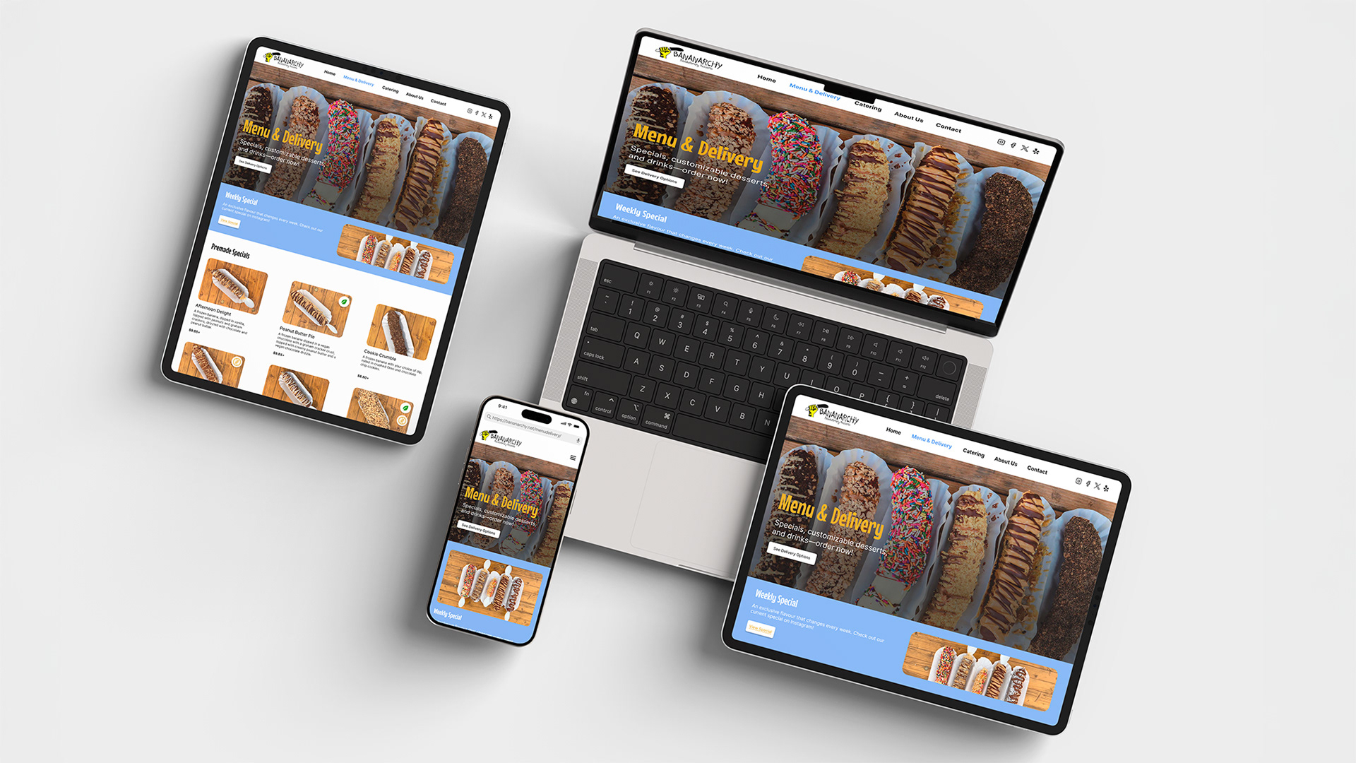
Bananarchy Website Across Devices
Project Background
Bananarchy is a frozen dessert food truck based in Austin, TX, known for its ethically sourced ingredients and playful, rebellious brand. The original website lacked clarity, visual appeal, and mobile optimization, making it difficult for users to find essential information about catering, delivery options, and the menu. It also failed to reflect the fun, engaging identity of the brand.
I was tasked with redesigning the website with a mobile-first approach, creating both mobile and desktop experiences that would improve user navigation, content clarity, and visual engagement. The redesigned site needed to highlight Bananarchy’s core values, such as vegan options and ethical sourcing, while integrating up-to-date delivery partnerships. The project included user research, journey mapping, and testing, all aimed at building a site that is as bold as the brand it represents.
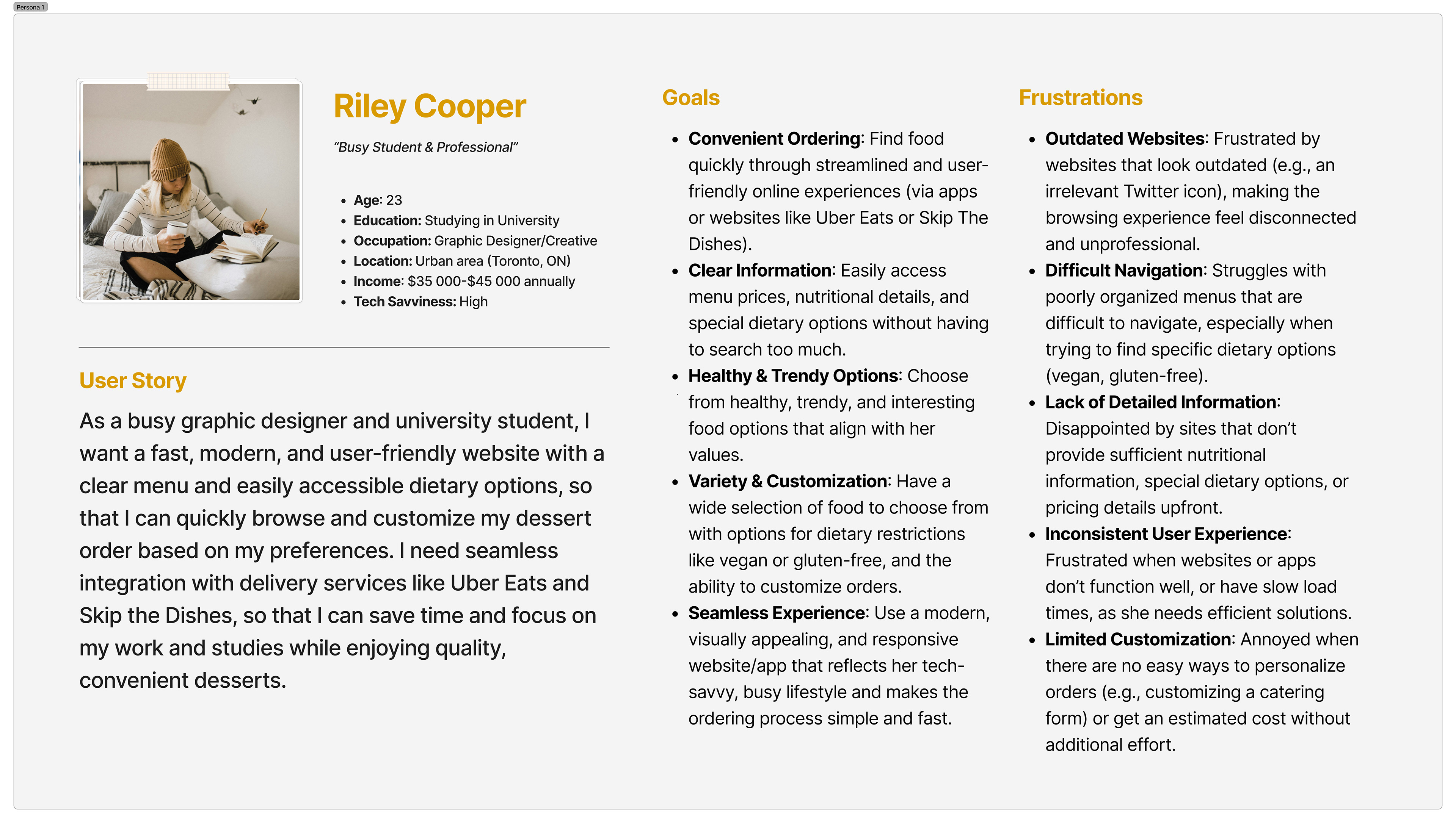
User Persona
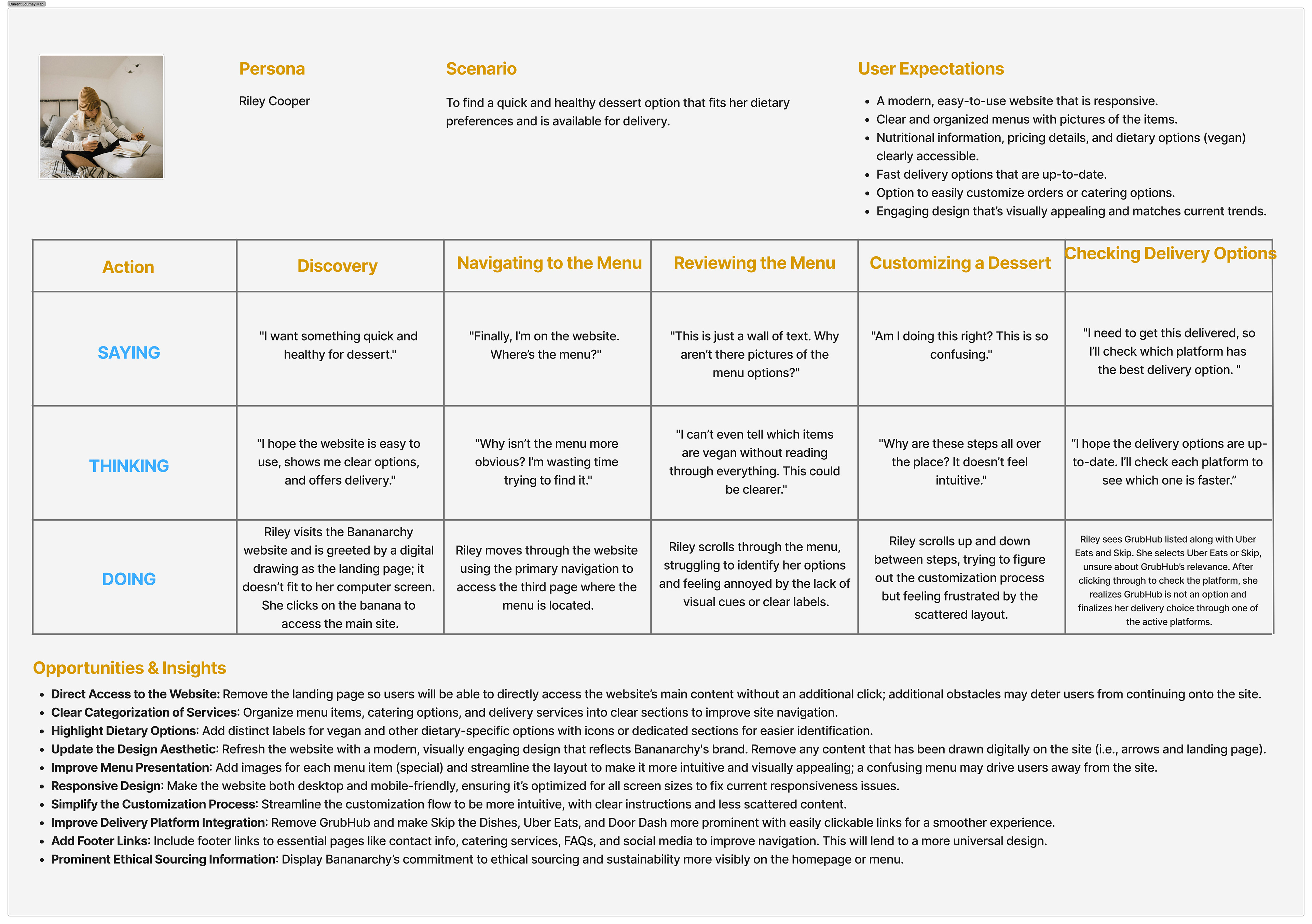
Current User Journey Map
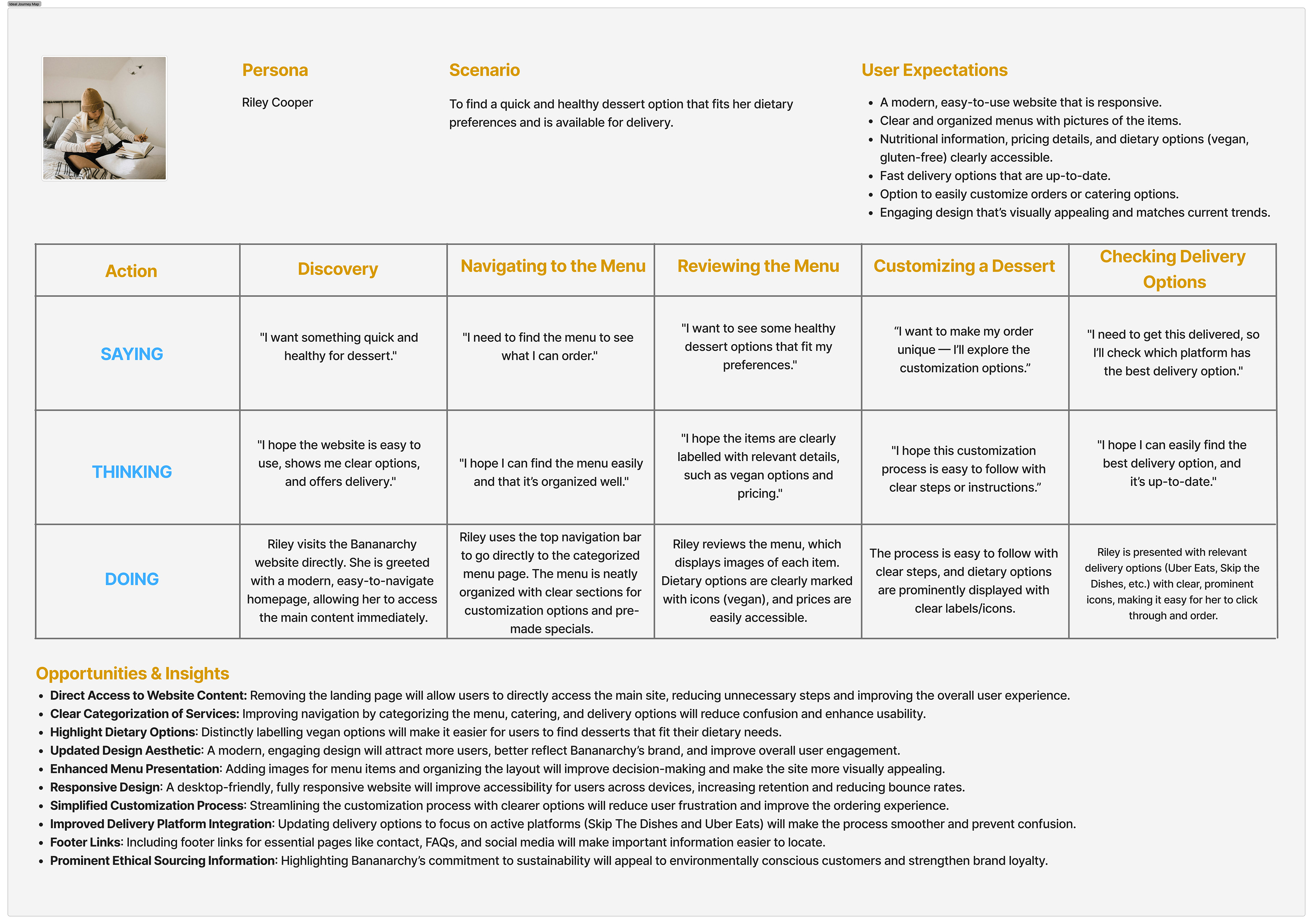
Ideal User Journey Map
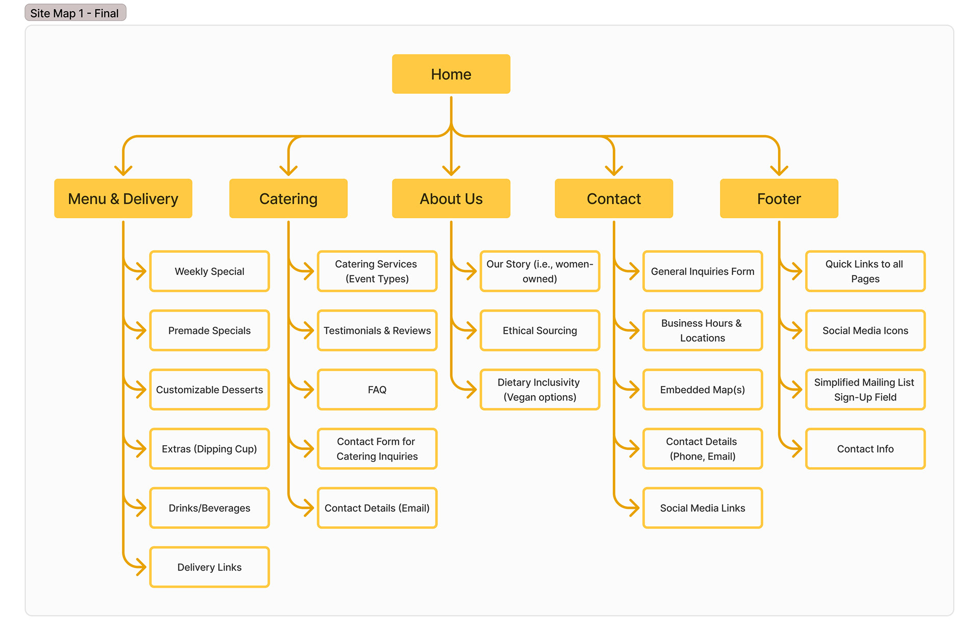
Site Map - Version 1 (Final)
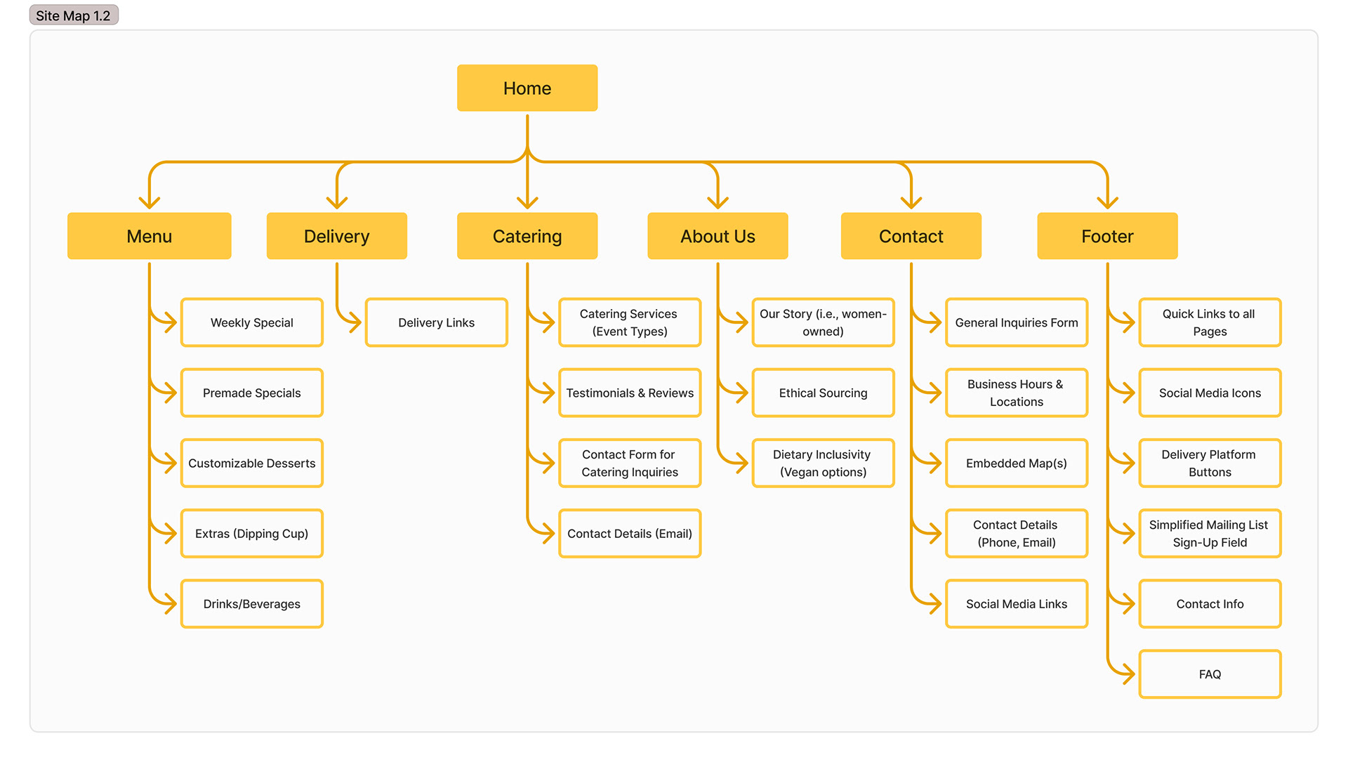
Site Map - Version 1.2
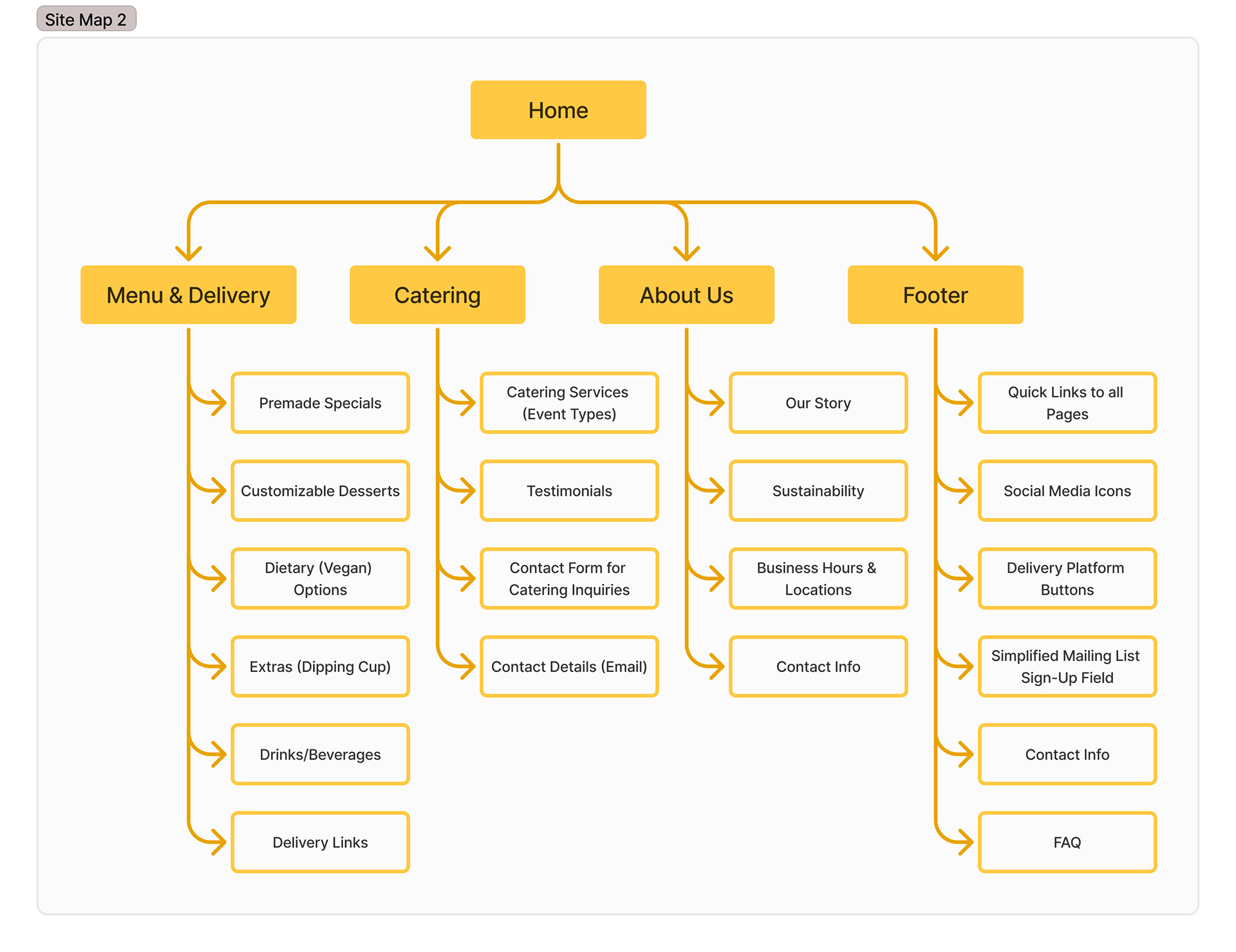
Site Map - Version 2
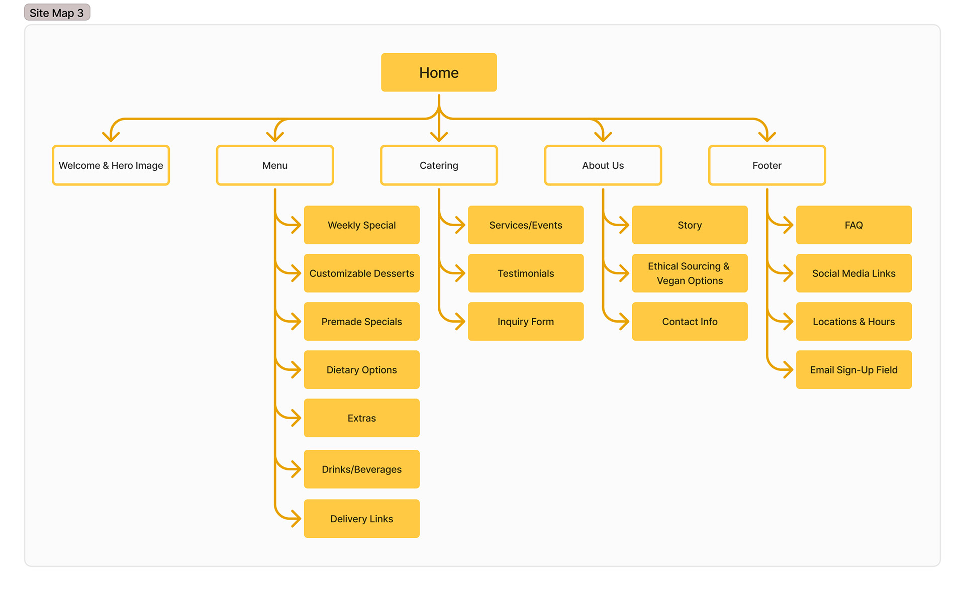
Site Map - Version 3
Obstacle & Approach
The initial challenge was translating Bananarchy’s vibrant personality into a clear and user-friendly website. To ground the redesign, I based its development on user interviews and created a user persona, journey maps, and iterative sitemaps. One key insight from this research was the need for better clarity around service categories like catering and delivery, along with the importance of responsive design for users on the go. The target audience included students looking for trendy, health-conscious treats, professionals seeking quick delivery options, and event planners needing reliable catering details. These users value speed, visual clarity, and an experience that reflects the bold personality of the brand.
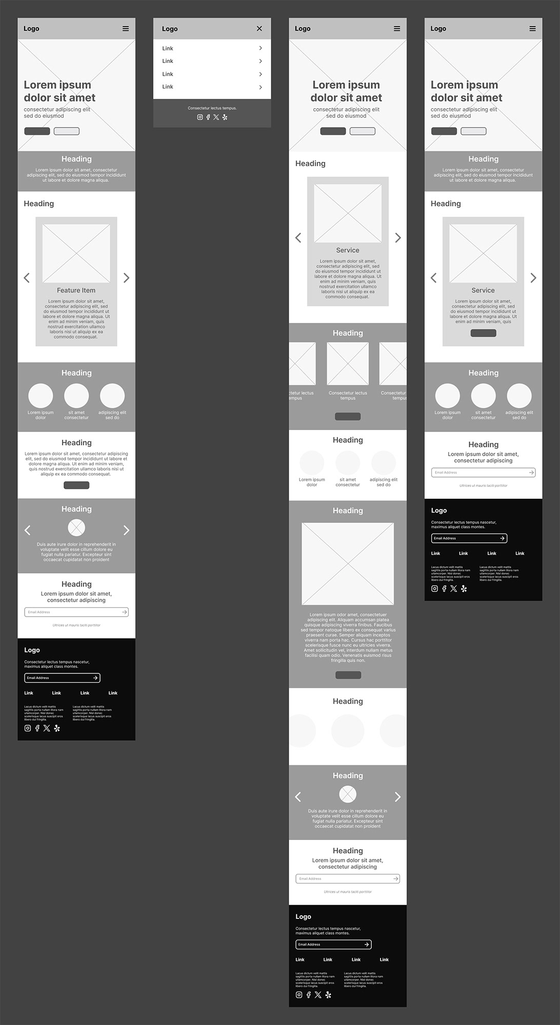
Home Page Wireframe - Mobile
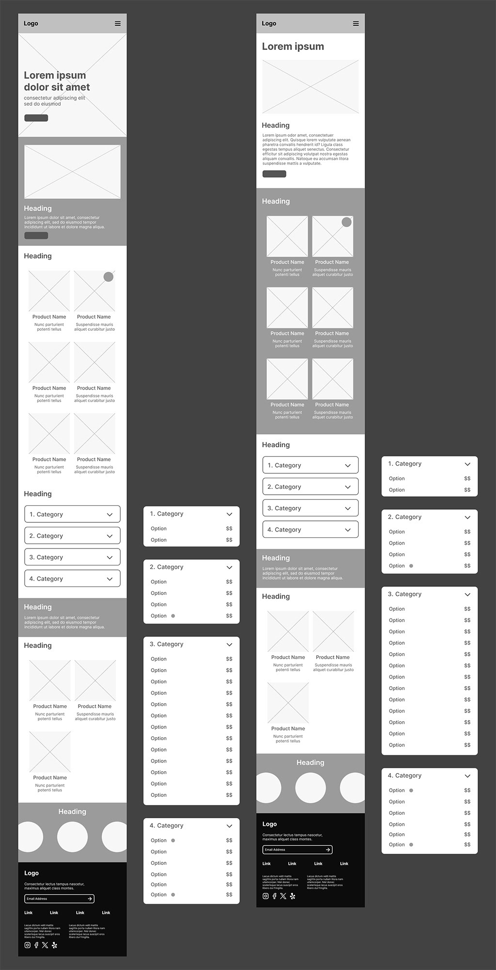
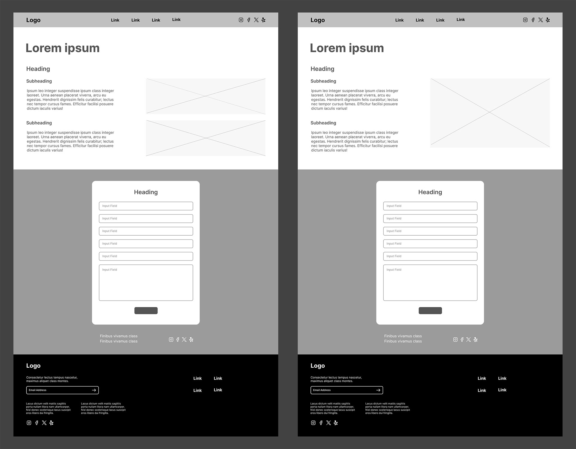
Menu & Delivery Page Wireframe - Mobile
Catering Page Wireframe - Mobile
About Us Page Wireframe - Mobile
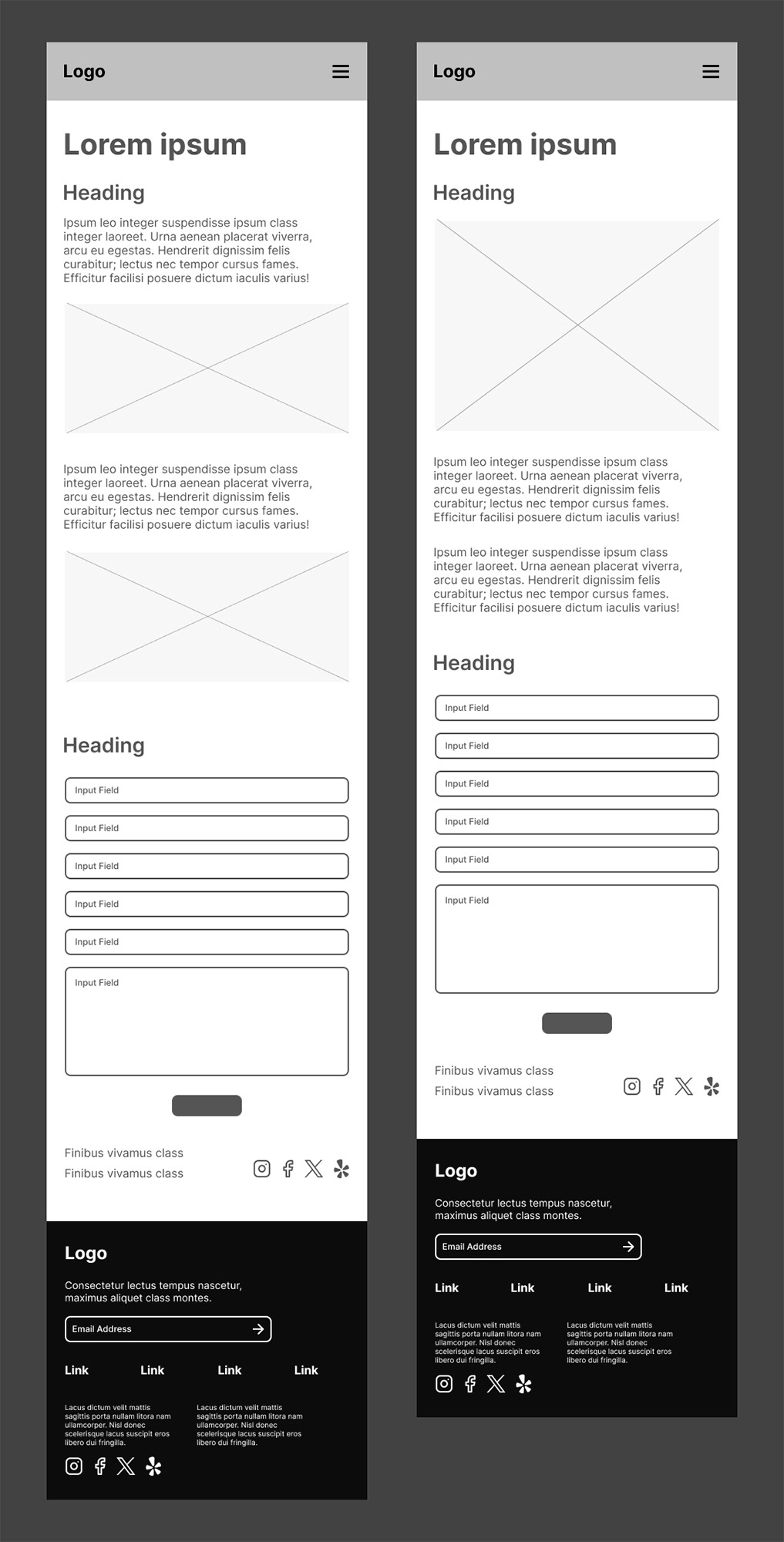
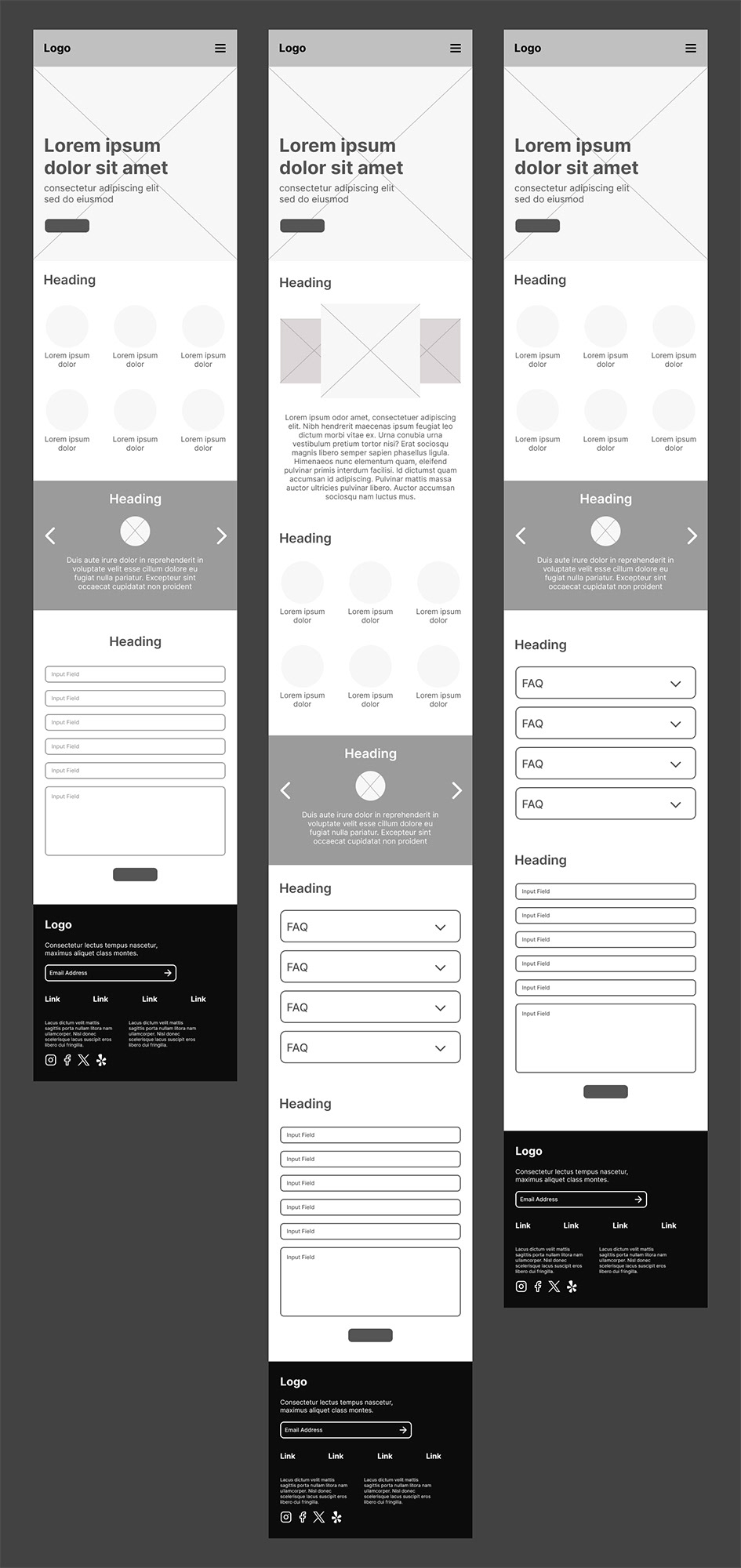
Contact Page Wireframe - Mobile
To begin wireframing, I explored several layout options to test how users might navigate the content. These wireframes went through multiple rounds of iteration based on user needs and feedback. I focused on structuring content in a way that allowed users to easily identify service categories, find important brand values like vegan options, and connect with delivery platforms. This mobile-first approach ensured the content would remain clear and accessible on any device.
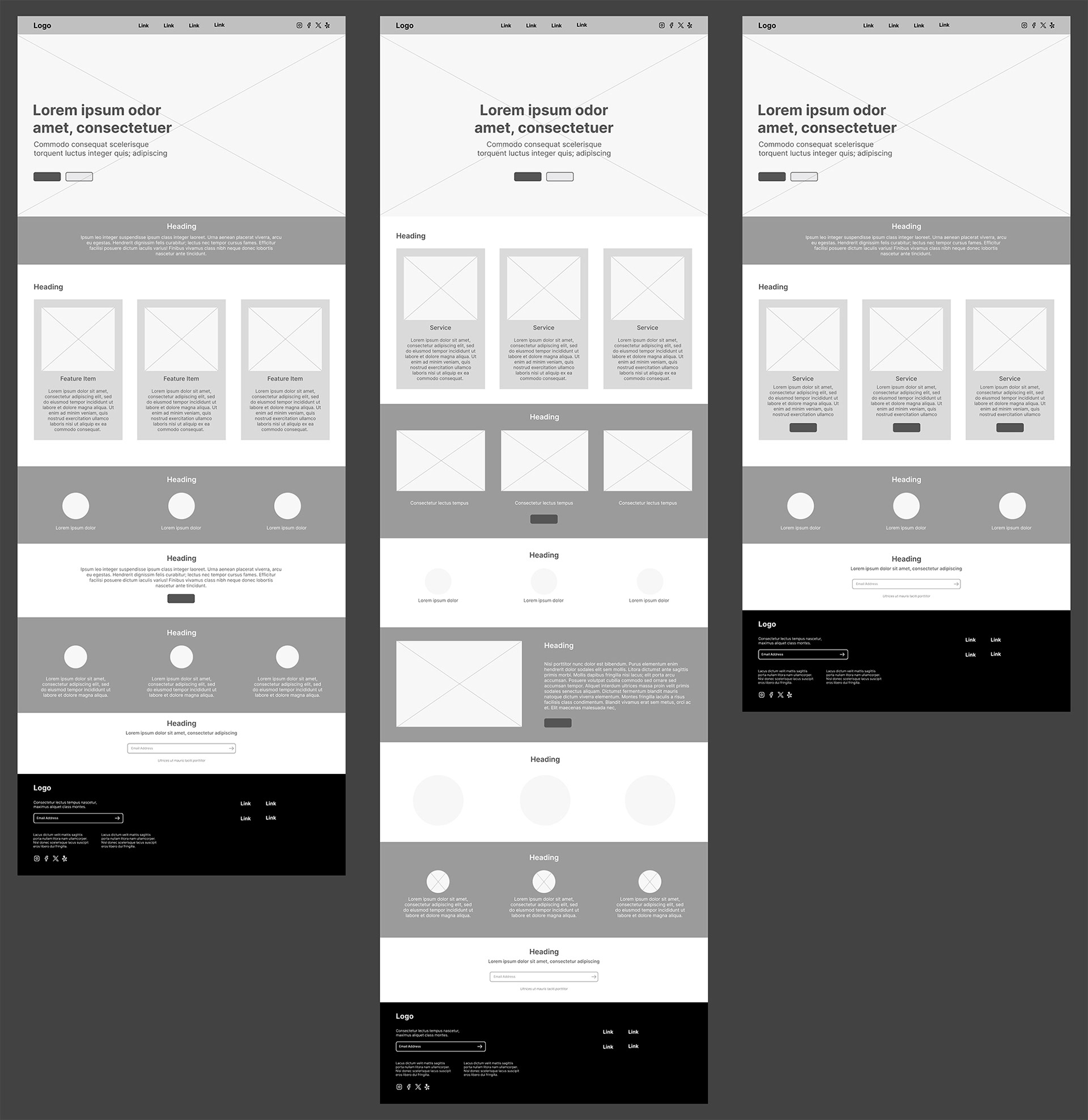
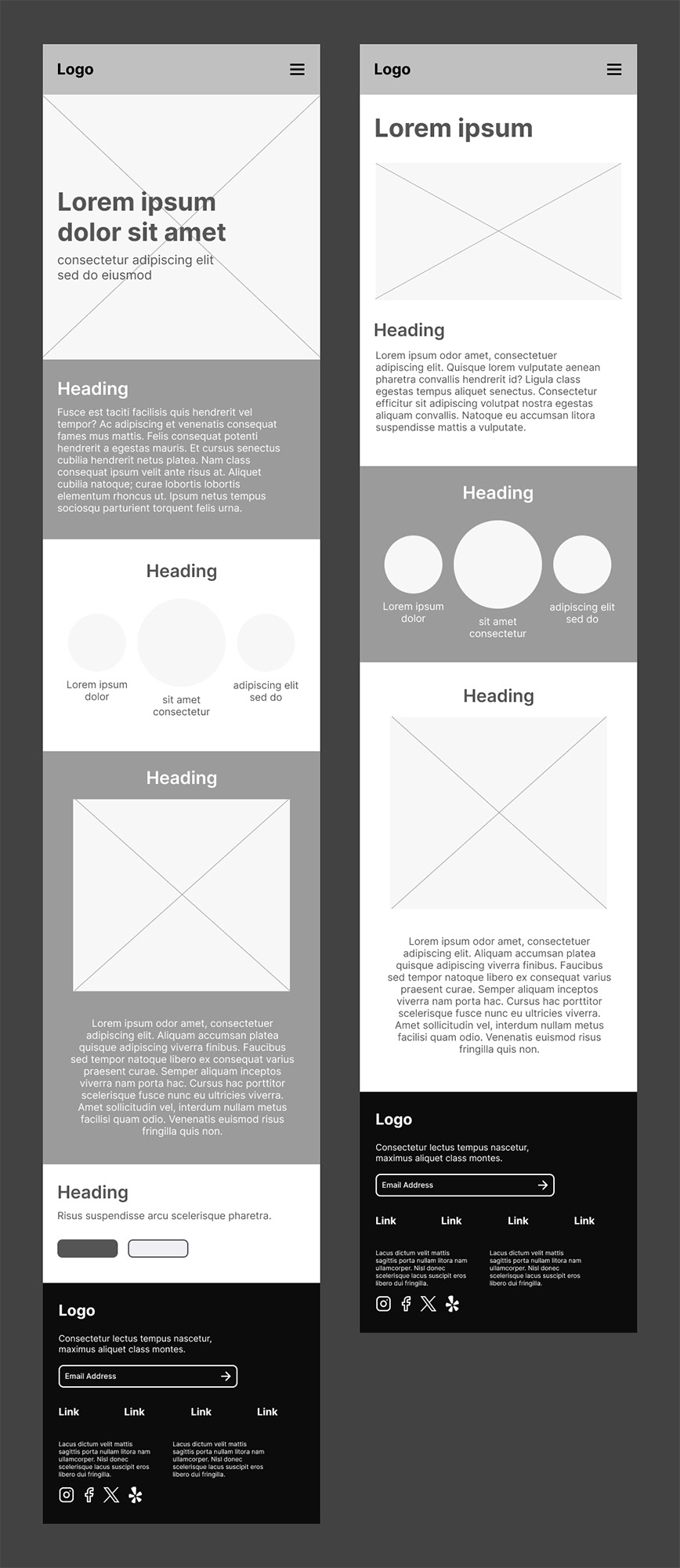
Home Page Wireframe - Desktop
Menu & Delivery Page Wireframe - Desktop
Catering Page Wireframe - Desktop
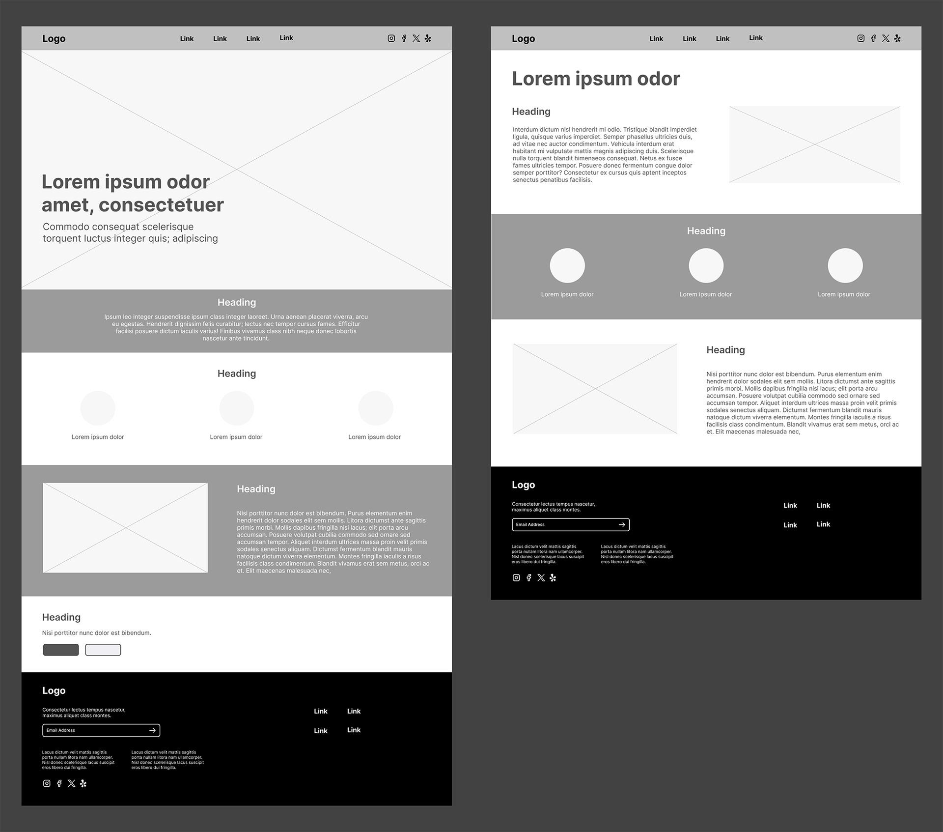
About Us Page Wireframe - Desktop
Contact Page Wireframe - Desktop
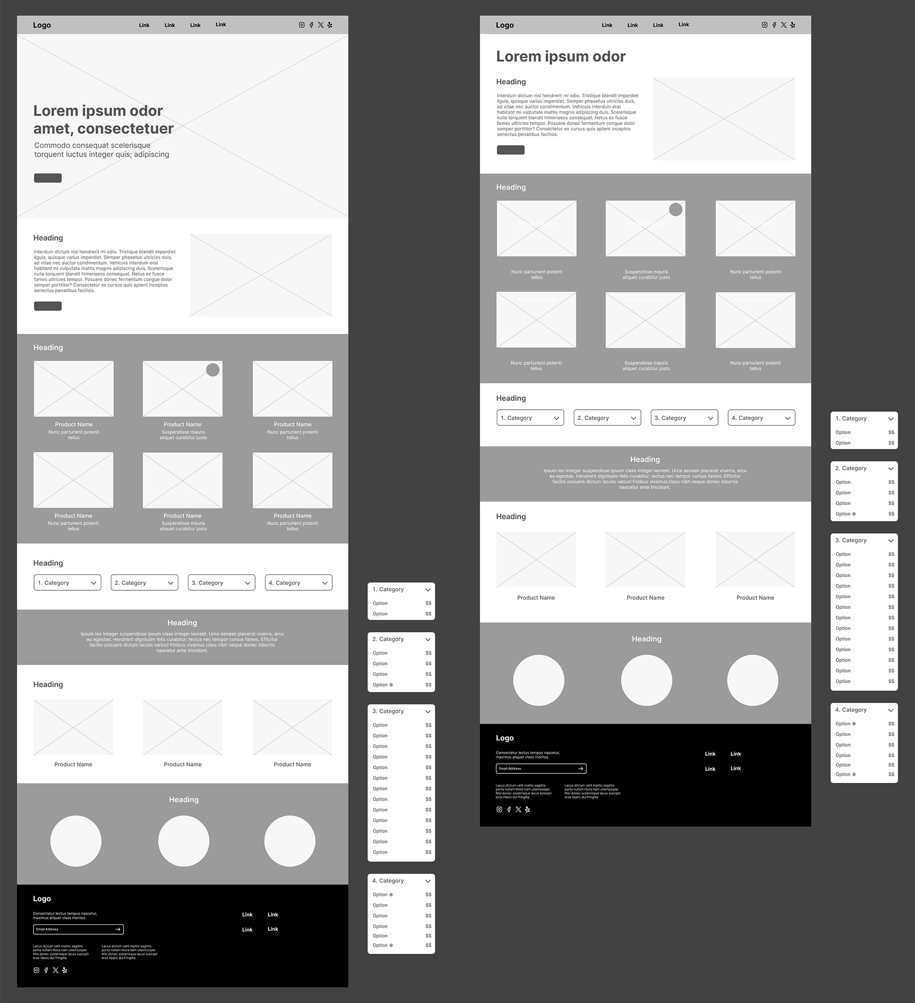
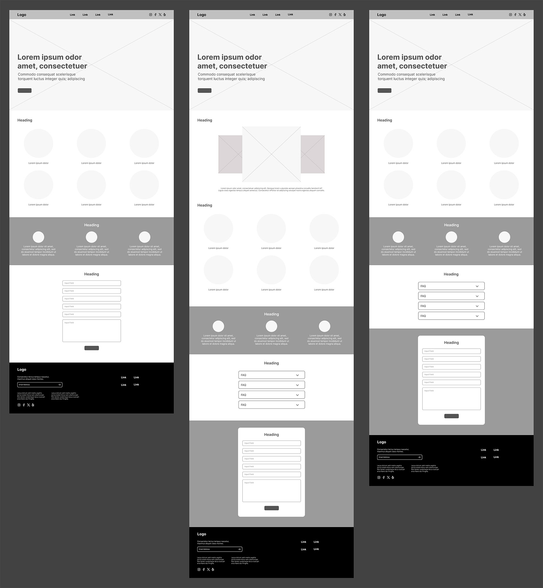
High-fidelity mockups were built from the strongest wireframe direction for both mobile and desktop versions. The final visual system used bold colours, expressive typography, and simple icons to reflect Bananarchy’s rebellious but friendly personality. I included interactive visual elements such as dietary icons (a leaf for vegan, a wheat symbol for gluten-free) to support quick decision-making. These elements tested well, especially in terms of visibility and ease of use.
I conducted user testing focused on basic heuristic principles. Users responded positively to clear navigation, immediate feedback from buttons and links, and the ability to return to the homepage via the logo. They also appreciated visual clarity and consistency across the site. However, some minor issues were flagged. The homepage email sign-up field was not interactive, which confused users who expected it to function like other forms. Others felt that while the design was clean and user-friendly, it could use more playful elements to better reflect the brand’s fun, over-the-top energy.
In response, I revised the sign-up field to better reflect its intended use, added visual cues to make interactive fields more consistent, and incorporated additional brand elements like dynamic shapes and bolder type where appropriate. I also refined the navigation system to reflect page status more clearly, helping users stay oriented while browsing.
Figma’s free version posed a few limitations, such as the lack of fully functional form fields and alt text support. To work around this, I used component variants to simulate interactivity and maintained strong contrast and typographic hierarchy for better accessibility. These adjustments kept the design inclusive and easy to navigate within the constraints of the tool.
This project required balancing strong brand expression with accessibility, usability, and technical feasibility. The final result reflects an iterative, user-driven process that brought clarity, personality, and structure to Bananarchy’s online experience.
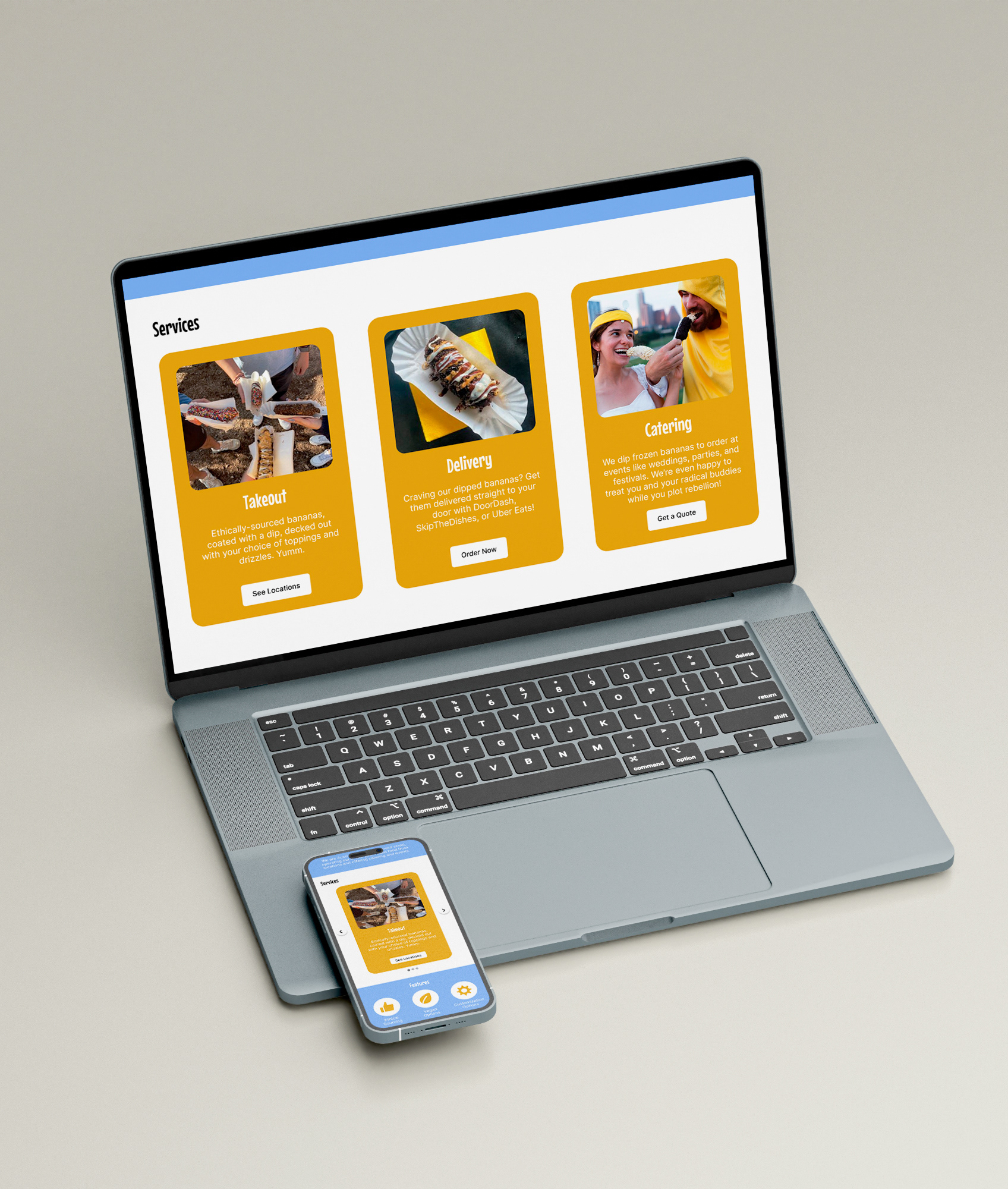
Bananarchy Responsive Home Page

Bananarchy Catering Page on iPad
Summary
This project challenged me to apply user-centered design thinking across every stage of the redesign process, from early research to final refinement. Through interviews, testing, and iteration, I built a mobile-first and desktop site that reflects Bananarchy’s bold personality while improving usability, accessibility, and overall structure. Clear navigation, reorganized content, and playful brand elements work together to create a more engaging and intuitive experience for users across devices.
Working within real constraints pushed me to problem-solve creatively. Whether simulating interactivity in Figma or refining form design for clarity, each decision was made with the user in mind. This redesign reinforced my belief that strong design goes beyond visuals. It is about building thoughtful, functional systems that connect people to brands in meaningful ways.
Programs Used: Adobe Photoshop, Adobe Illustrator, Figma