

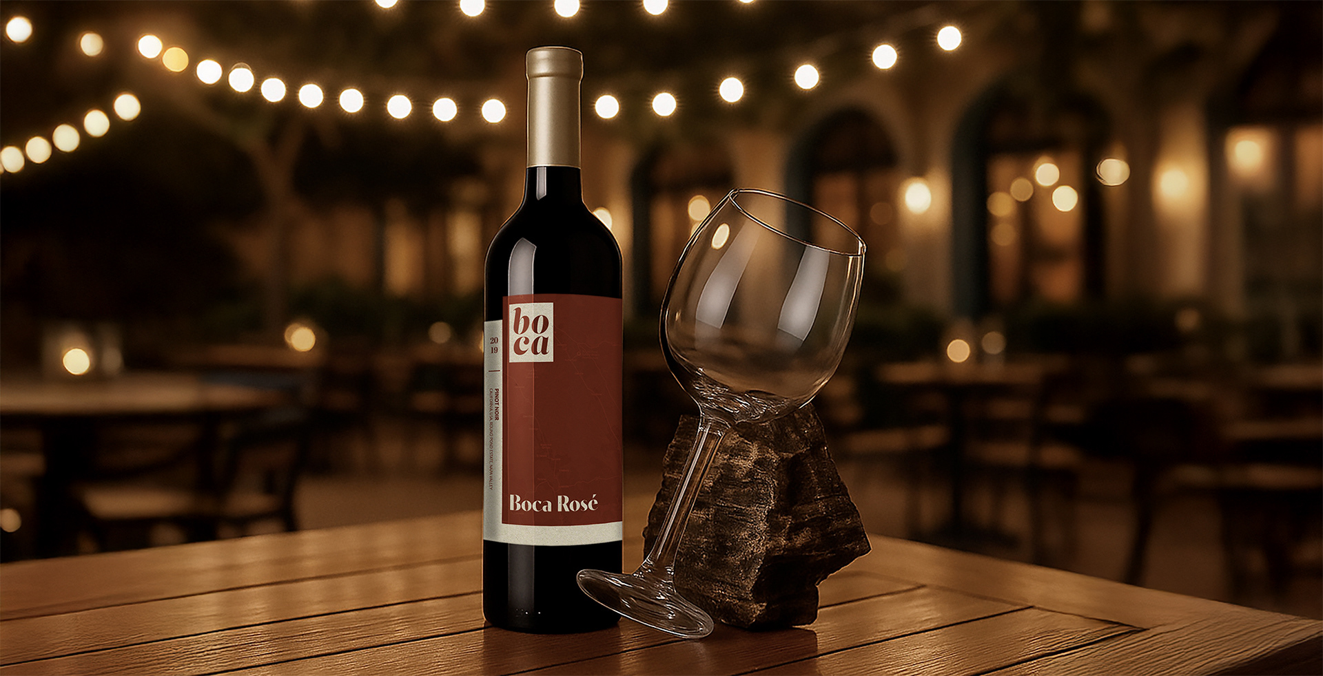
Boca Rosé Wine Label on Restaurant Patio Table
Project Background
This passion project explores the visual identity and label design for Boca, a fine-dining concept inspired by the cuisine and charm of the French Riviera, southern Italy, and coastal Spain. Boca is imagined as a modern Mediterranean restaurant located in Regina’s Warehouse District, designed to offer a warm, elevated experience that blends rustic character with refined European hospitality. Rooted in the client’s personal story of travel, heritage, and passion for food, the brand emphasizes clean, health-conscious cuisine, exceptional wines, and heartfelt service. The branding needed to reflect this vision: simple yet sophisticated, bold yet welcoming, in both tone and aesthetic.
As part of the brand rollout, I designed a series of wine labels for Boca’s house red, white, and rosé. These labels were intended to be revealed during the restaurant’s rebrand launch and required thoughtful integration of the existing logo, consistent design language, and production-ready dielines.
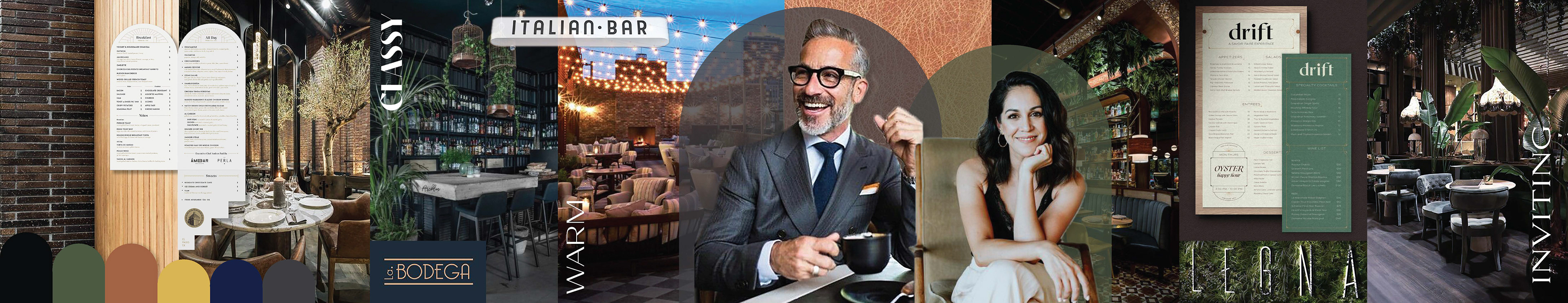
Boca Conceptual Stylescape
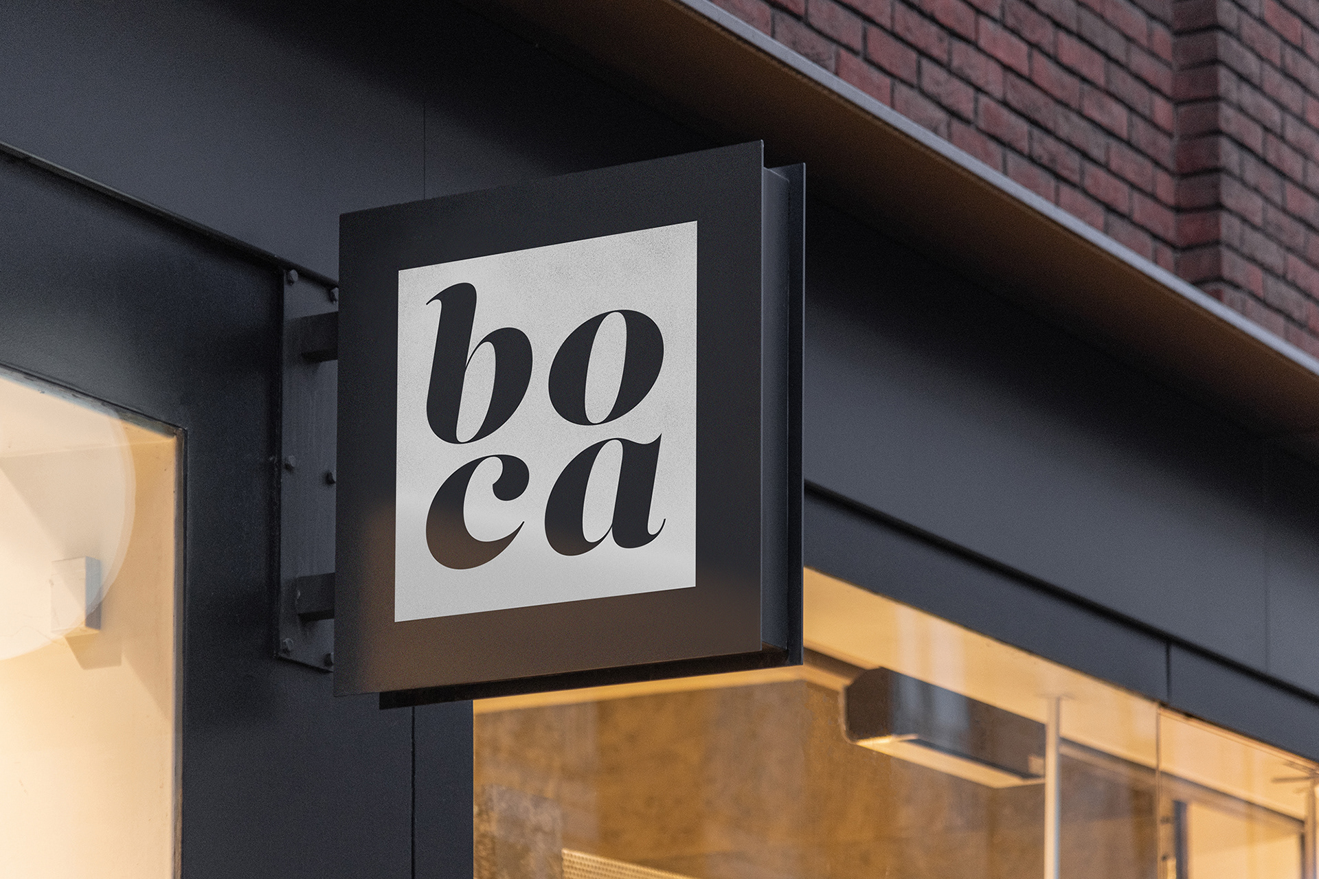
Boca Restaurant Signage
Obstacle & Approach
The challenge for this project was to create three distinct yet cohesive wine labels that felt high-end, understated, and true to the Boca brand. The labels needed to complement the varying bottle colours (black for red, green for white, and red for rosé) while working as a unified set that would be unveiled at the restaurant’s rebrand launch. There was also a requirement to use a single, custom dieline shape, incorporate varnish as a design element, and maintain tight alignment with the creative brief.
At the start, I explored a more conventional approach, considering hand-drawn illustrations of the fruits that appeared in each wine’s flavour profile. While visually charming, this direction felt too expected for the modern, elevated identity Boca was aiming for. After stepping back and reassessing the project goals, I pivoted toward a more unconventional, catered solution that emphasized subtlety and a sense of place rather than literal imagery.
Rather than opt for a traditional, centered layout, I leaned into an off-centre, modern label design. The misalignment brings a sense of spontaneity and boldness, a quiet confidence that fits Boca’s upscale yet approachable identity. Each label also integrates a tonal map texture referencing the vineyard region (France for the red, British Columbia for the white, and California for the rosé), layered subtly in the background. This approach introduced a narrative quality without overwhelming the minimalist design.
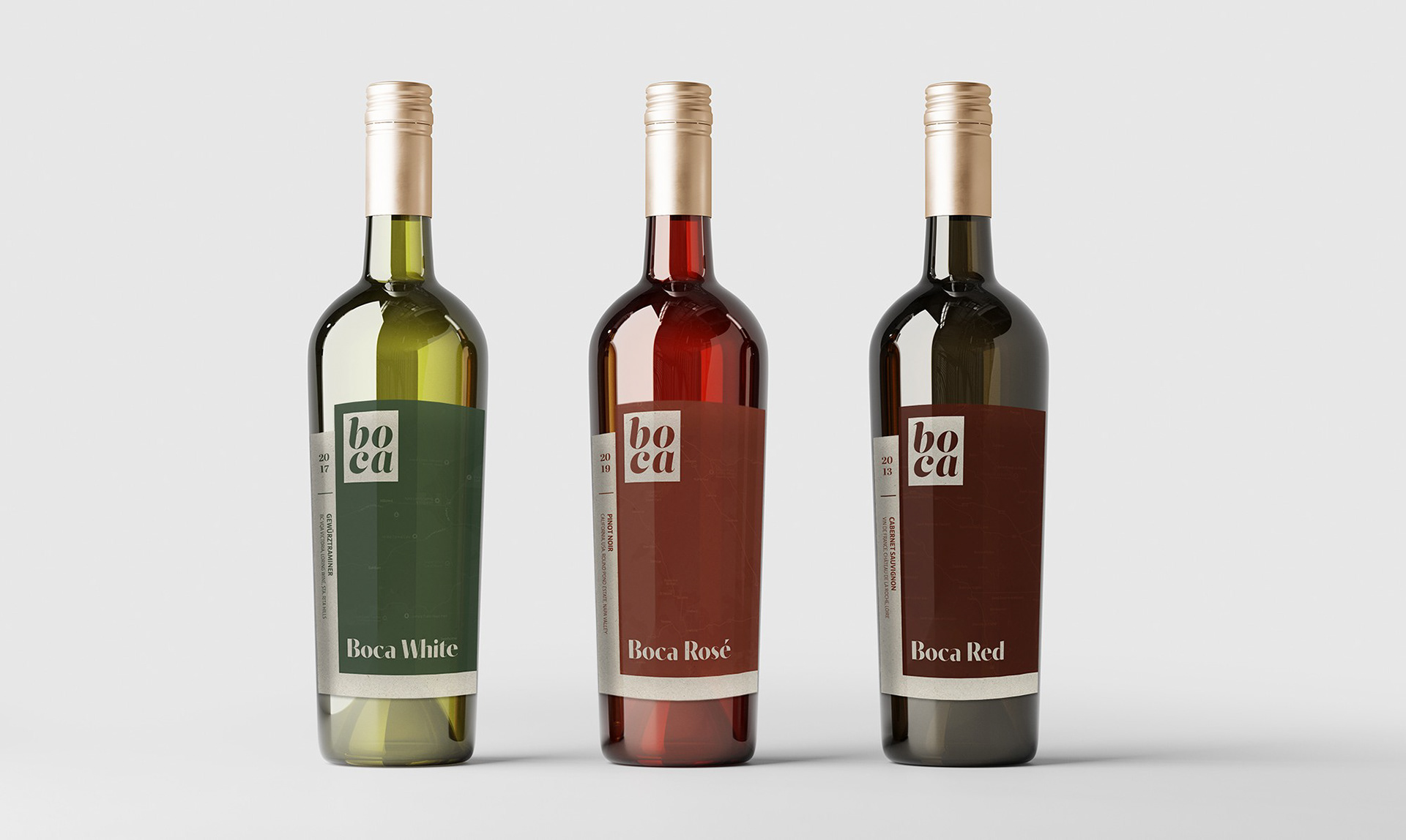
Boca House Wine Labels
Summary
The final outcome included three distinct, print-ready labels for Boca Red, Boca White, and Boca Rosé, each tailored to the wine’s flavour profile and bottle colour, unified by a consistent design language. Realistic mockups were prepared to showcase the labels in context, and the dielines included all necessary print specs for digital press production, including spot varnish and dieline layers.
This project demonstrates how brand identity can be translated into functional, elegant packaging that strengthens the overall customer experience. Every decision, from type choice to label shape, was rooted in the brand’s core values: quality, warmth, clarity, and sophistication.
Programs Used: Adobe InDesign, Adobe Photoshop, Adobe Illustrator