

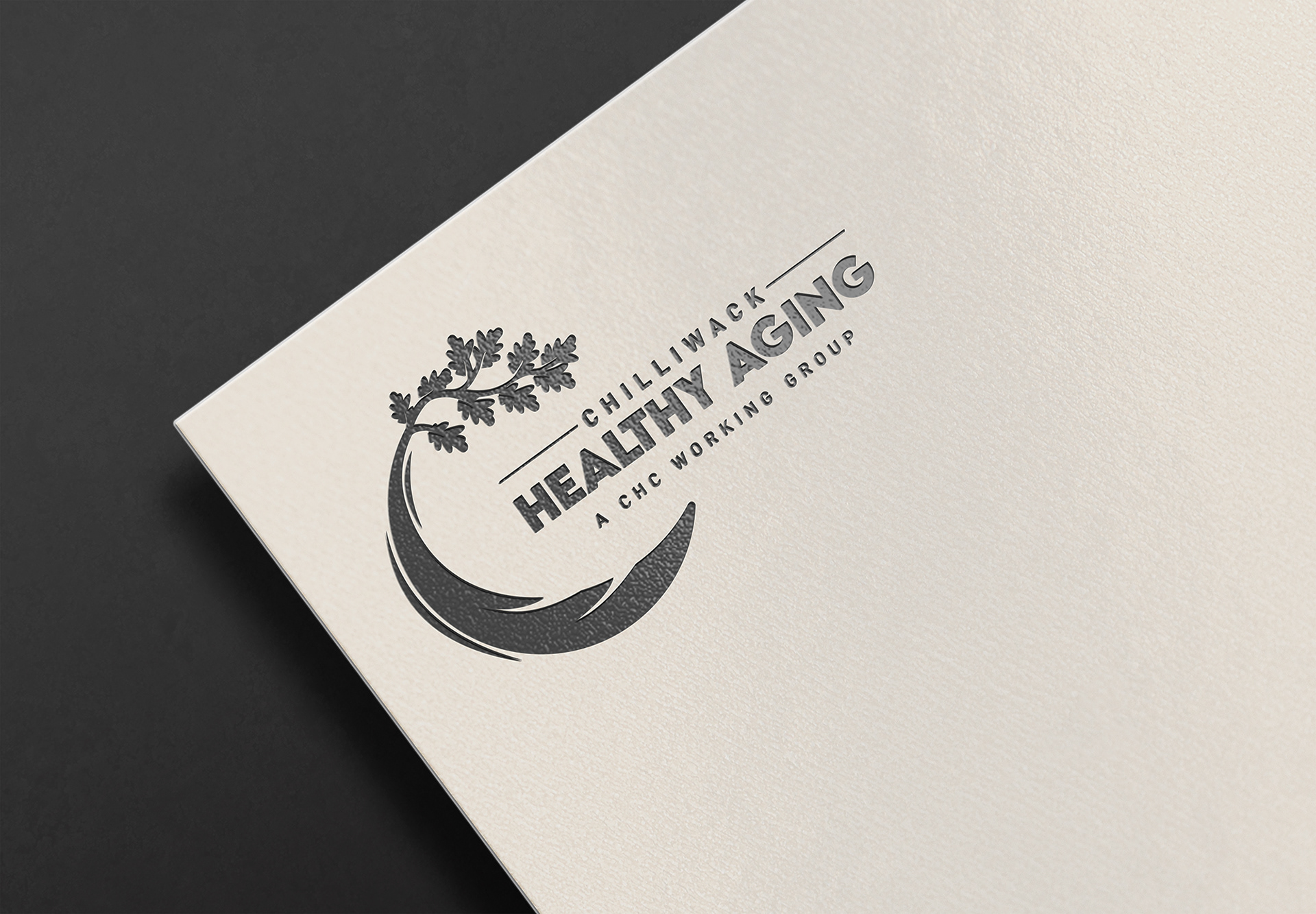
Nested Logo on Stationary
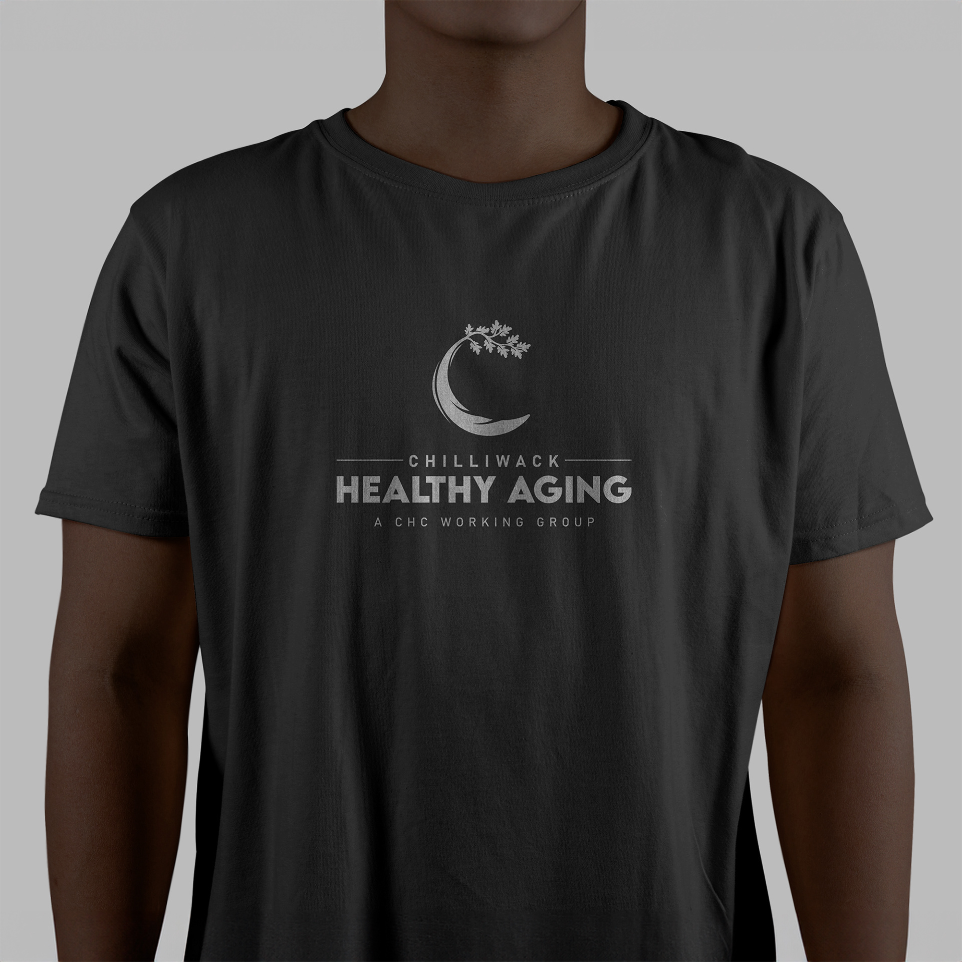
Vertical Logo on T-Shirt
Client Background
Chilliwack Healthier Community (CHC) is a network of local partners based in Chilliwack, British Columbia. They focus on affordable/accessible housing, mental health, addictions, poverty reduction, cultural safety and humility, and more. They want their citizens to live in a healthy, caring community that focuses on quality of life, promotes a sense of belonging, and understands that dignity begins when basic needs are met. CHC actively addresses the most persistent issues affecting the health and well-being of the Chilliwack community through public education, collaboration and service integration.
The Chilliwack Food Council and the Chilliwack Healthy Aging group are some of the task teams of CHC. My primary focus for this project, the Healthy Aging Task Team, supports older adults in Chilliwack by increasing awareness of existing services and developing solutions to identified gaps.
Further information can be found on their website: Chilliwack Healthier Community
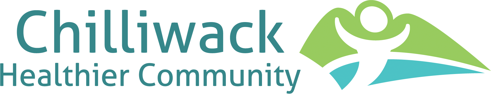
Chilliwack Healthier Community - Supplied Logo
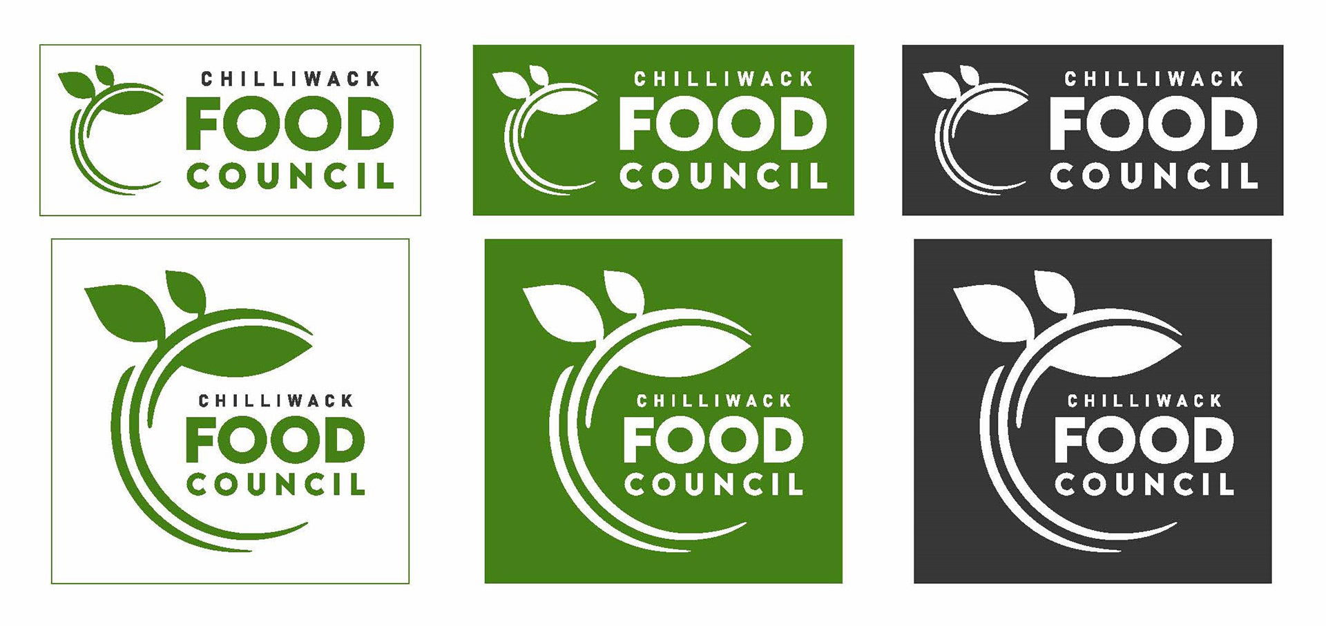
Chilliwack Food Council - Supplied Logos
Obstacle & Approach
A representative from Chilliwack Healthier Community reached out to me in need of a logo for one of their Task Teams, Chilliwack Healthy Aging. They shared an existing logo used by a related initiative, the Chilliwack Food Council, as a reference point for tone and structure. We had an in-depth video meeting to discuss their goals, values, visual preferences, and ideal timeline. This helped me understand not only their expectations, but also the deeper meaning they wanted the logo to carry.
I began by designing a set of logo options using the Food Council’s font and layout structure as a baseline to ensure visual consistency across related groups. Maintaining cohesion between Task Teams was key to strengthening their overall brand recognition. I presented several refined concepts with mockups to help them visualize the logos in real-world scenarios. After their internal review, I received detailed feedback on what was working and what needed to shift — from typography adjustments to more specific iconography.
One of the key points of iteration came through the discussion of the logo’s central tree icon. The group was drawn to the symbolism of growth and wisdom, but wanted a tree that felt more grounded in British Columbia’s identity. I explored several species before landing on the Garry Oak, which is the only oak native to BC and carries strong associations with longevity, healing, and resilience. I incorporated the tree’s branching and root structure to subtly echo BC’s mountainous landscape, while also emphasizing themes of protection and support.
Once the final design was approved, I created a complete logo package including vertical, horizontal, nested, and icon-only variations, along with a usage guide and over 240 organized logo files for web and print. The project spanned about a month and a half, wrapping just ahead of their September 2024 launch. Thanks to clear communication and strong collaboration with their liaison, we were able to stay right on schedule.
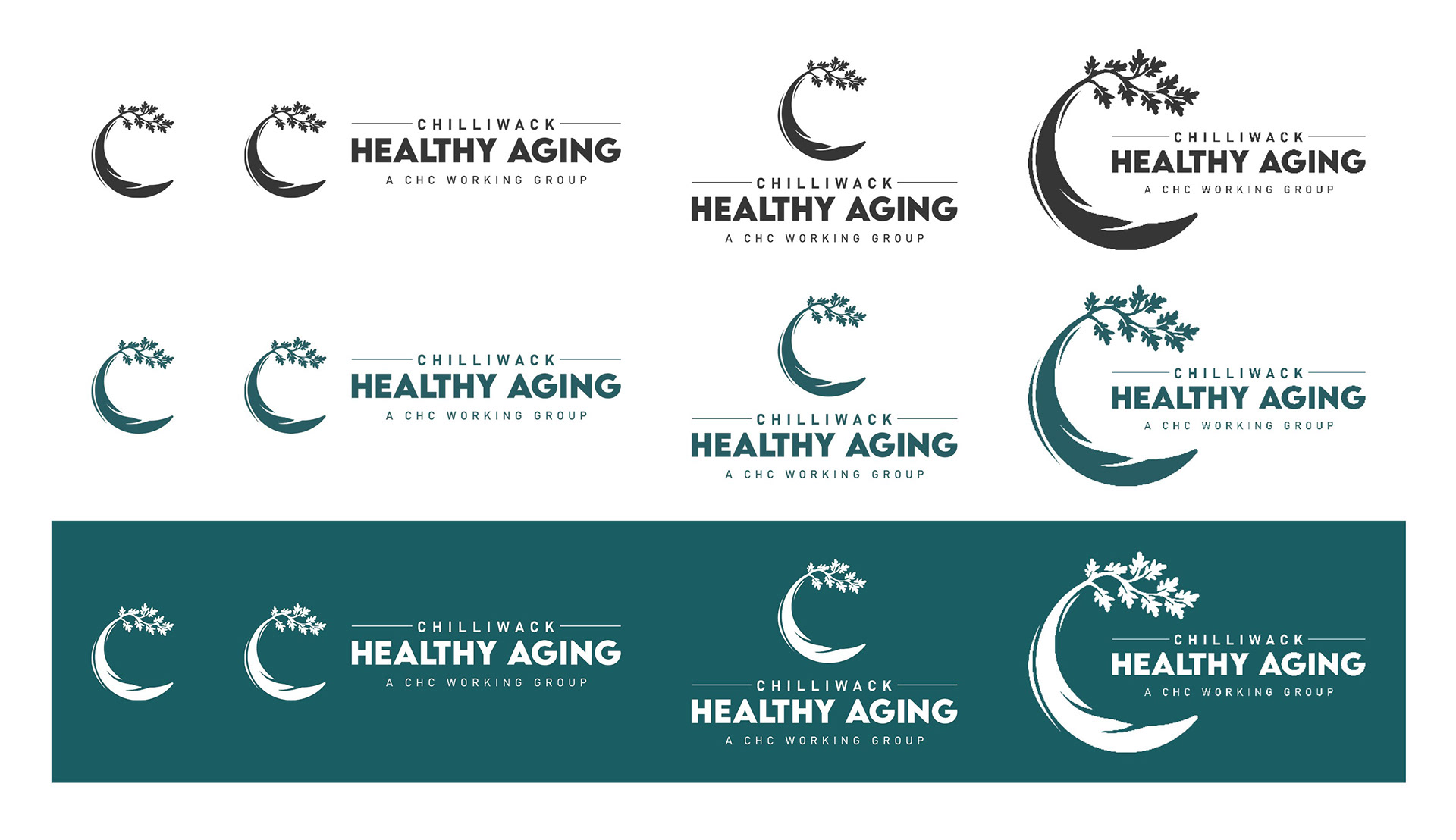
Logo Variation Guide
Summary
Reflecting on this project, I’m truly grateful for the opportunity to bring the Chilliwack Healthy Aging Task Team logo to life. It was a meaningful design challenge with a purpose I deeply respect. Collaborating with Chilliwack Healthier Community was a pleasure, and I would be excited to partner with them again on future initiatives.
Programs Used: Adobe InDesign, Adobe Photoshop, Adobe Illustrator