

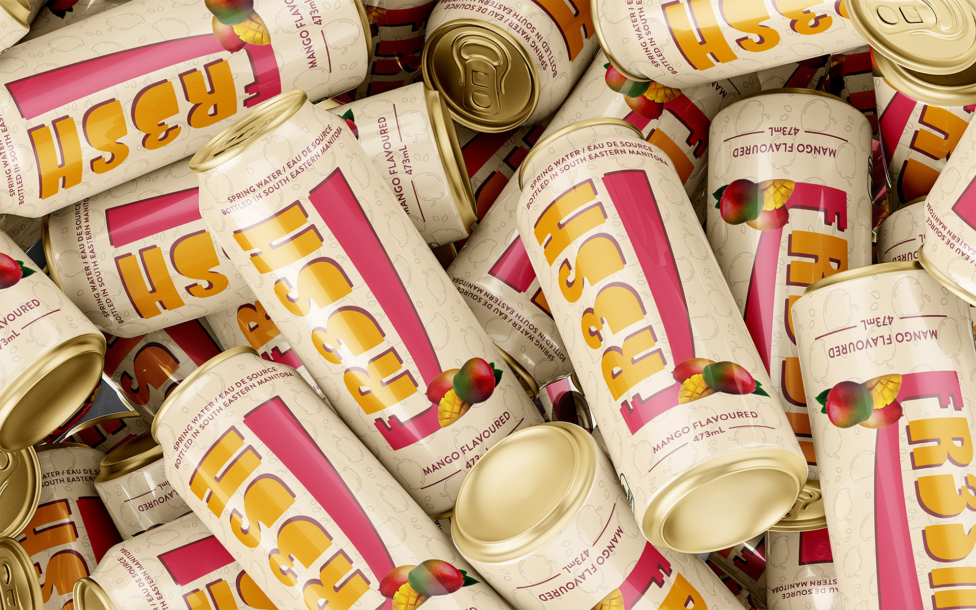
FR3SH Mango Cans
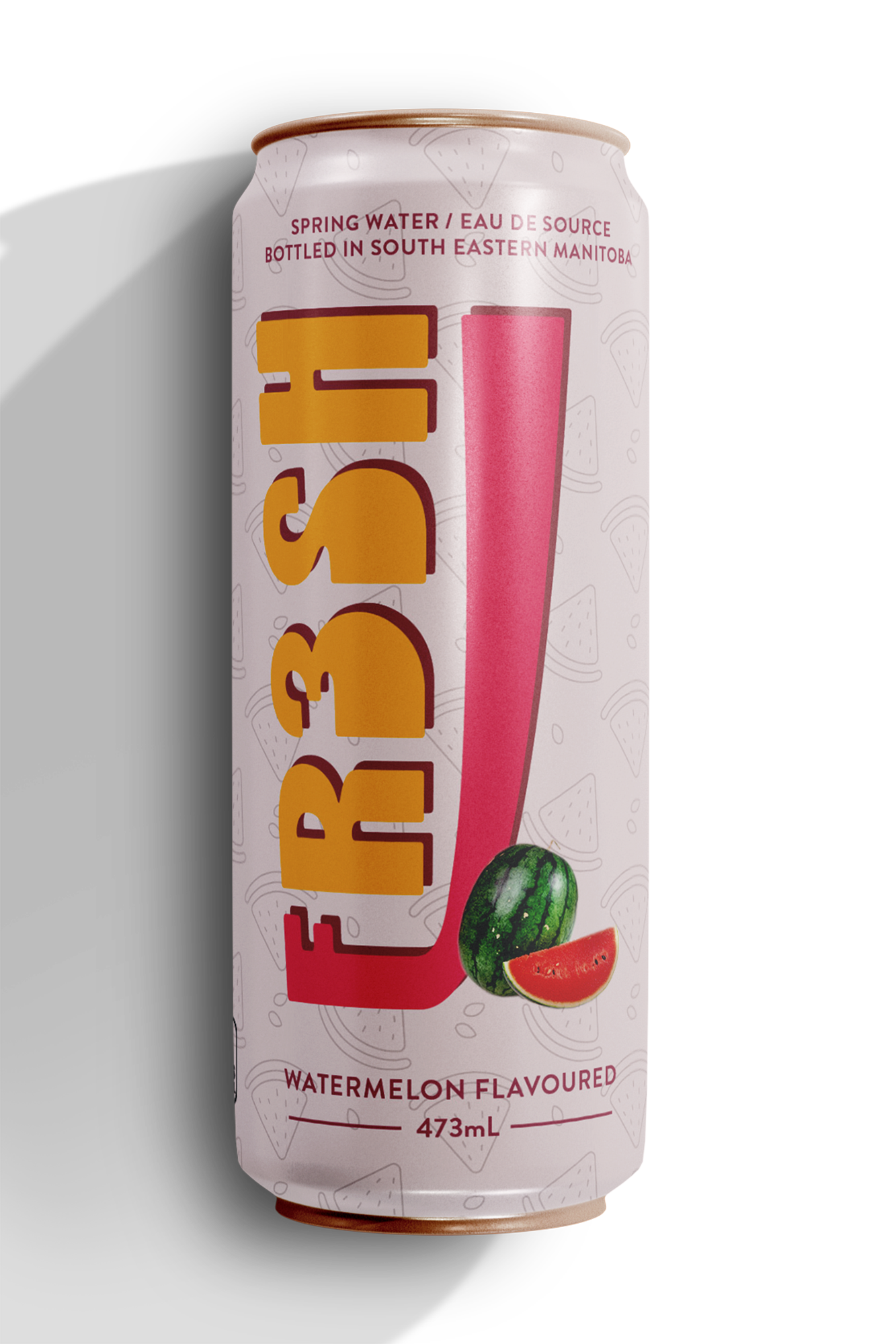
FR3SH Watermelon Can
Client Background
FR3SH is a mock company based in South Eastern Manitoba. Their water is sustainably sourced from a natural aquifer located in the heart of protected provincial forests. The aquifer is a remnant of the last ice age; it is over 13 000 years old. The surrounding terrain naturally filters the water, leaving FR3SH with a rich mineral content, an alkaline pH of 8.1, and a crisp delicious flavour! The company prides itself on its naturally gluten free, vegetarian products, free of sodium. Their brand is 100% Canadian, therefore its carbon footprint remains small compared to its imported counterparts. FR3SH aims to be known as the sustainable source for flavoured water across the Canadian nation, appealing to individuals aged 18 to 35 who are both health conscious and environmental advocates. They wanted their packaging to appear fresh, authentic, and most importantly, vibrant!
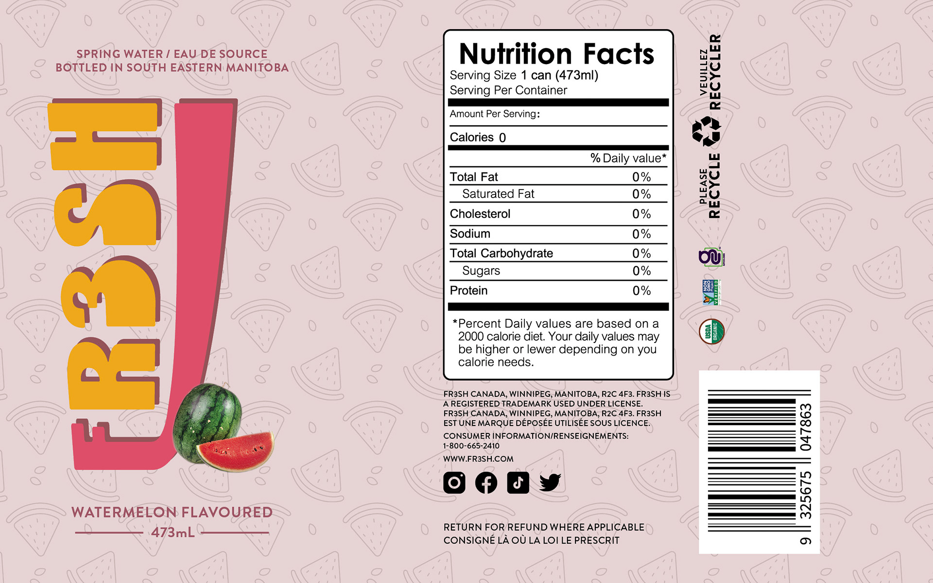
FR3SH Watermelon Dieline
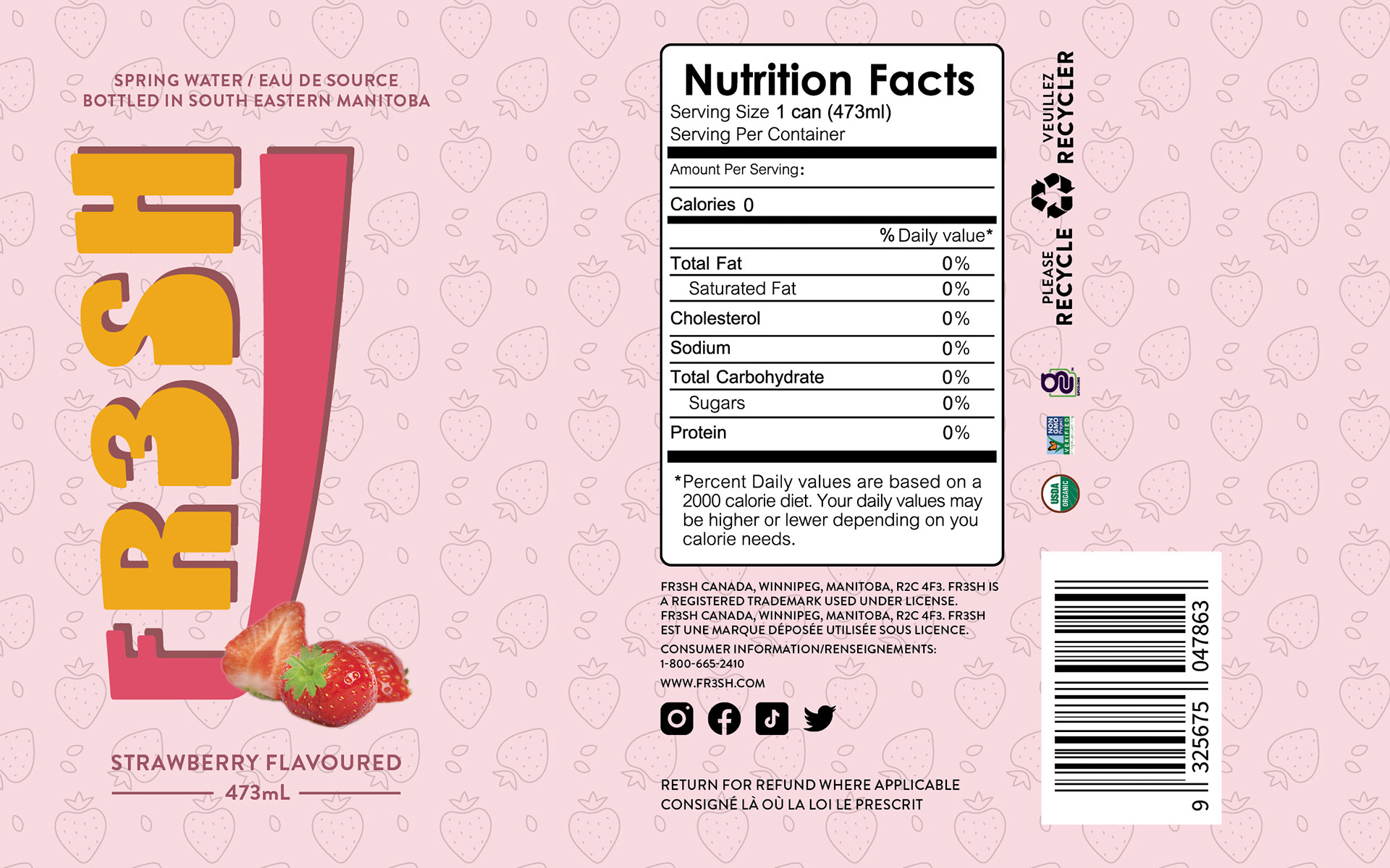
FR3SH Strawberry Dieline
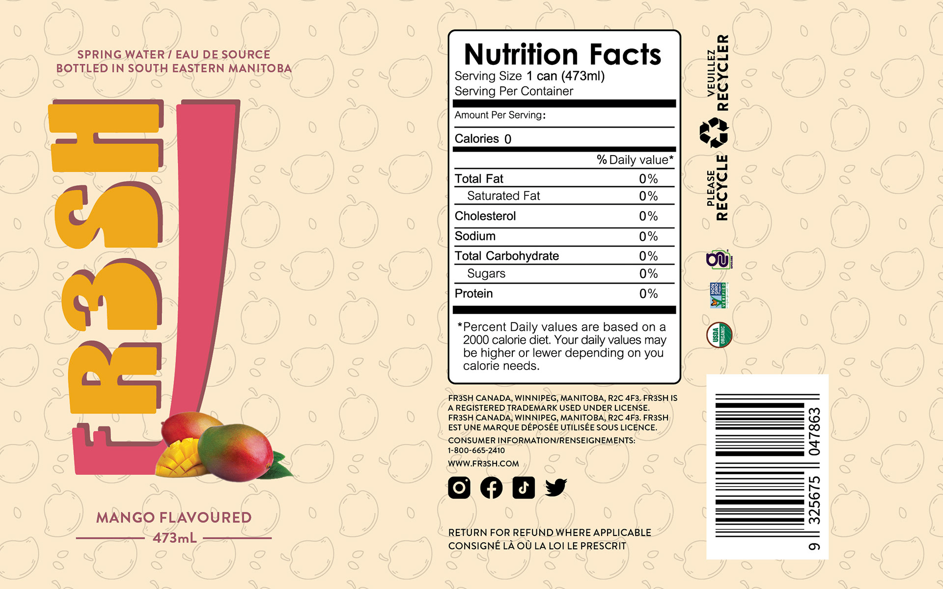
FR3SH Mango Dieline
Obstacle & Approach
For this project, I was tasked with designing a new logo for FR3SH along with conceptualizing three spring water can designs for the flavours watermelon, strawberry, and mango. The logo needed to include the word "FR3SH" in all caps, paired with a graphic element. A tri-colour version was required for primary use, with single-colour and black-and-white variations created for versatility across different formats.
In designing the logo, I considered how it would interact with the curved structure of an aluminum can. I drew inspiration from retro diner signage and the clean geometry of vintage vehicles, aiming for a balance of vibrance and authenticity. Each can design was built around a visual identity that emphasized natural ingredients. To reflect this, I created patterns inspired by each fruit and masked in photographic imagery to add energy and flavour recognition.
The biggest challenge was determining an effective layout for the can label, as I had not designed for a cylindrical surface before. To guide placement, I studied physical product references to understand the visual relationships between brand elements, barcodes, nutrition facts, and legal content. Once the layout was resolved, I refined each flavour design to ensure consistency in spacing, flow, and impact across the product line.
Summary
I’m pleased with the outcome of the FR3SH project, especially in how the branding and flavour visuals work together across the can designs. Although this was my first experience designing for a cylindrical format, it gave me valuable insight into layout and packaging constraints. Moving forward, I plan to continue building my skills in structural packaging to approach future projects like this one with even greater precision and confidence.
Programs Used: Adobe InDesign, Adobe Photoshop, Adobe Illustrator