

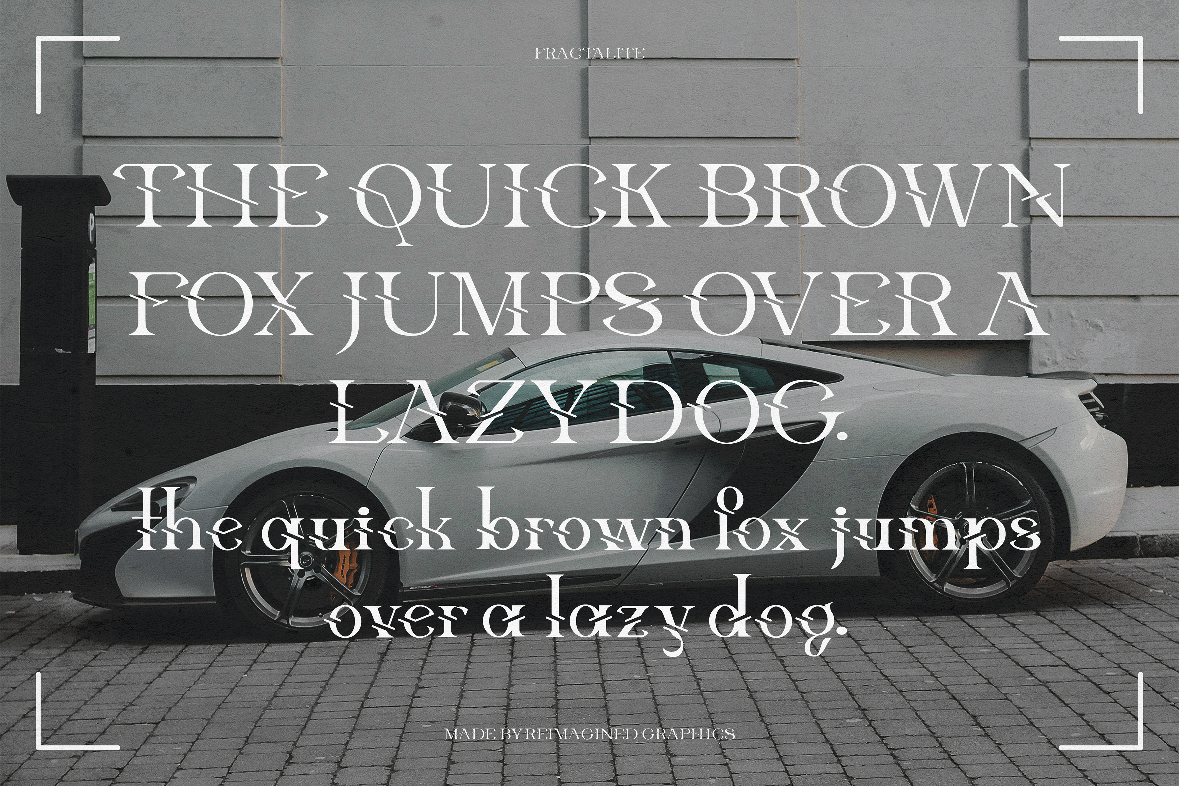
"Fractalite" Pangram
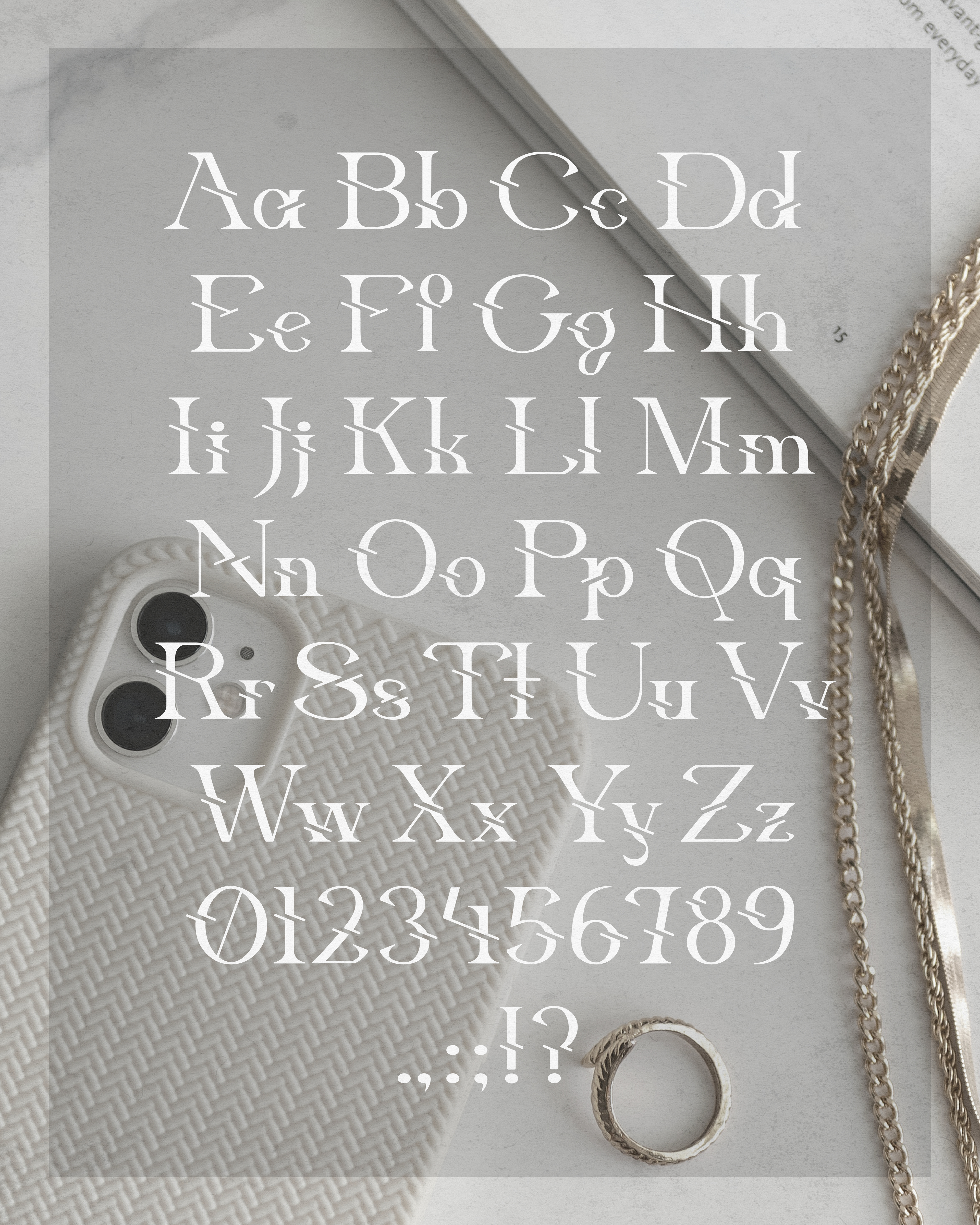
"Fractalite" Character Map
Project Background
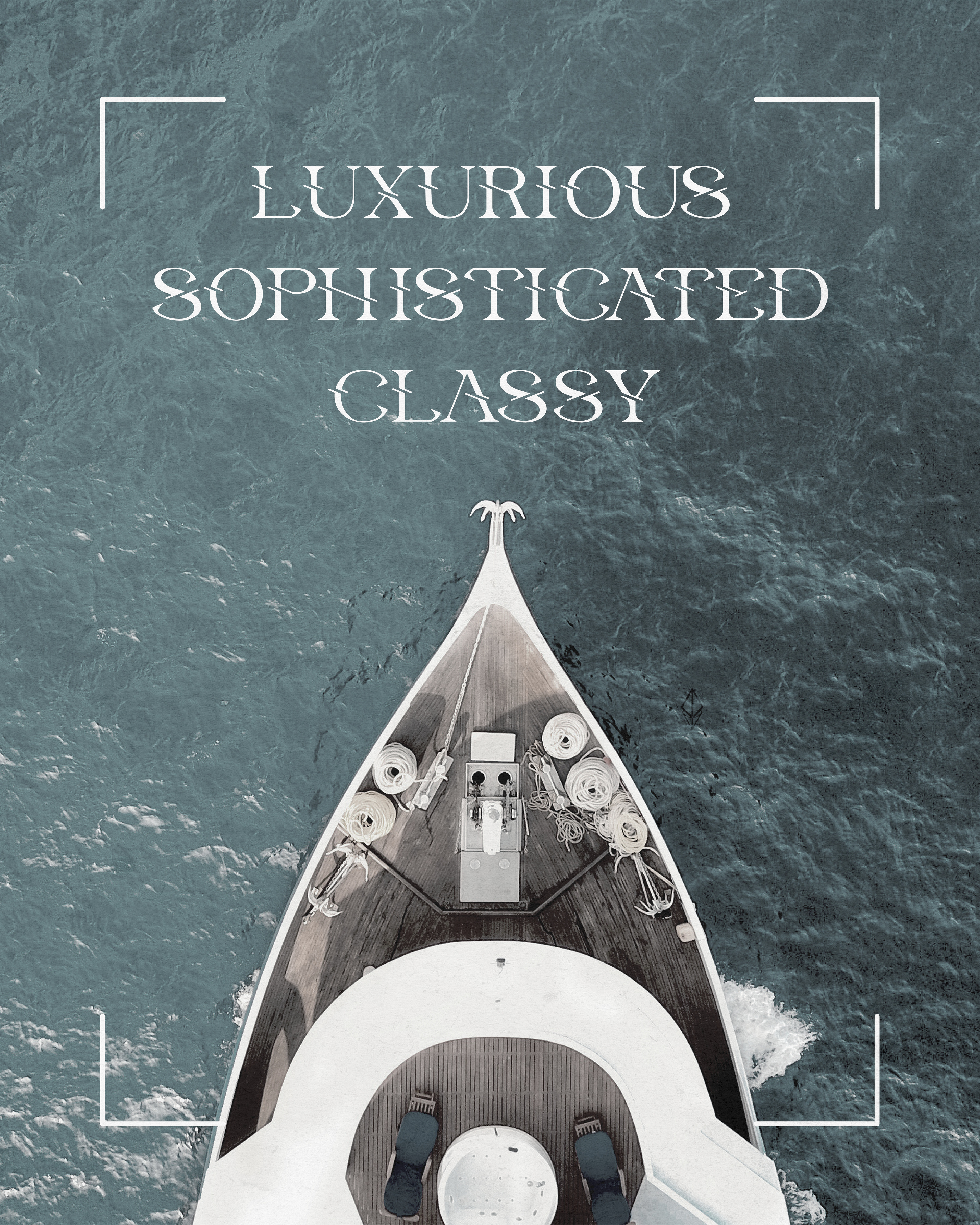
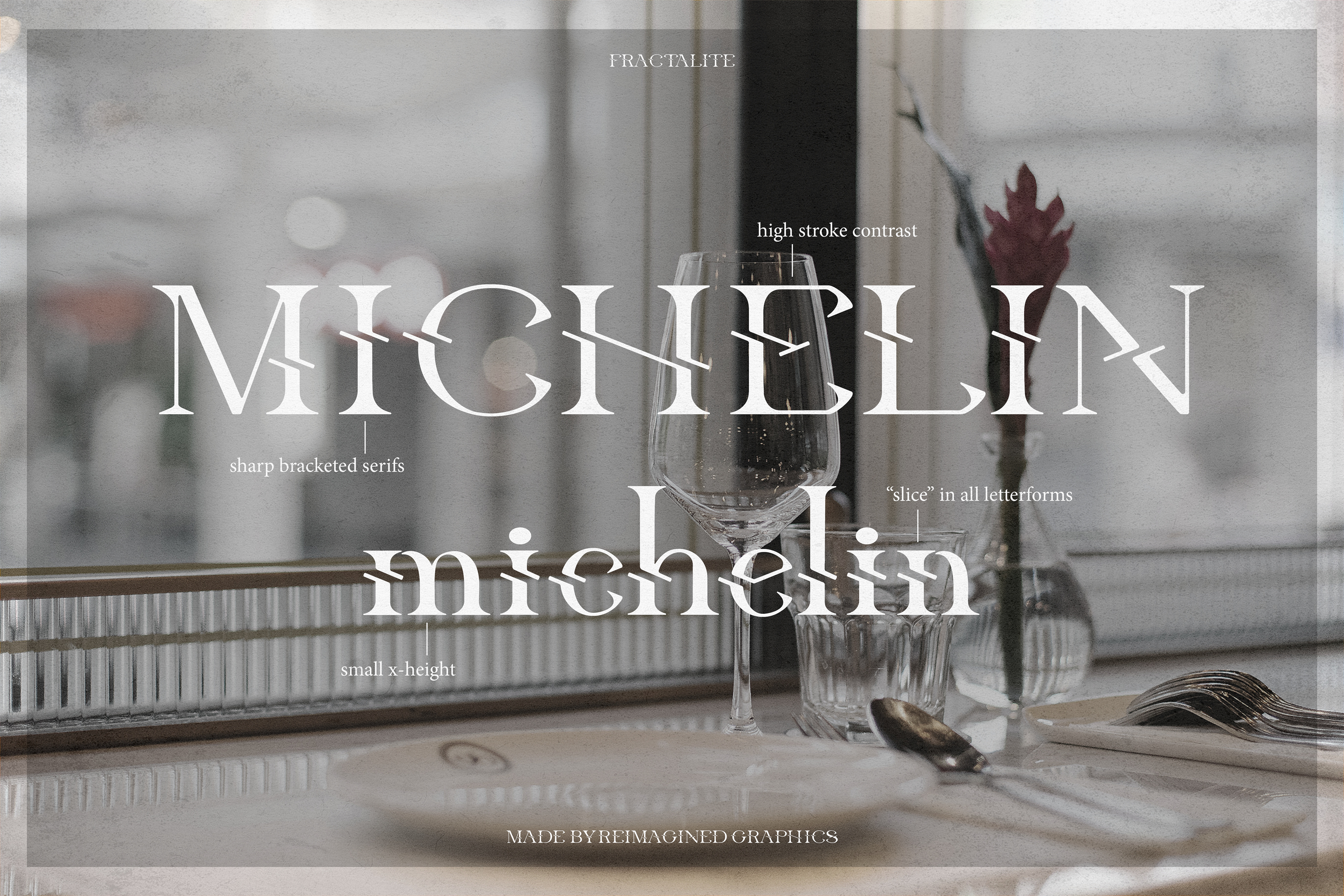
Initially, this project wasn't intended for client use. It is the first complete typeface I have developed; I hope to continue expanding it so that it can be used in a variety of applications and languages. In its current state, it functions as a single-weight display typeface for luxury brands. The name, "Fractalite", is based on the concept of light fractalization and reflects the font's diamond-like appearance. It makes use of high-contrast strokes, a small x-height, and a decorative "slice" through each letterform.
Obstacle & Approach
Designing this typeface was completely new territory for me. I had never attempted anything like it before, and figuring out where to start was a challenge in itself. I knew I wanted the final result to feel refined, clean, and high-end, so I started by researching a range of typefaces that shared those traits. I studied their structures and pulled inspiration from specific letterforms, using that as a foundation for building my own.
I began with basic shapes such as thick and thin rectangles and triangular serifs, and used them to construct a few key character combinations: OHSAP and ohsxp. These early letterforms helped me establish consistent proportions, curves, and spacing. As I expanded into the full alphabet, I realized that some characters needed reworking to better match the overall style. I went through several rounds of adjusting angles, stem weights, and spacing to bring more cohesion to the set. Designing both uppercase and lowercase letters added another layer of complexity, but also gave the typeface more versatility.
One of the biggest points of iteration came when I tackled the numerals. They initially felt disconnected from the letterforms, so I spent extra time refining their proportions and visual weight to bring them in line with the rest of the characters. Testing the characters together helped me catch small inconsistencies that were not obvious when working on individual glyphs.Once the characters were complete, I brought everything into FontSelf, where I made final alignment adjustments and fine-tuned the spacing along the baseline. After exporting the typeface into a functional font file, I tested it across different layouts to check readability and consistency. I plan to continue developing the typeface with extended character support to make it even more versatile for future use.
Summary
Designing this typeface was a valuable learning experience that pushed me to think critically about form, consistency, and visual expression. I’m proud of what I created and how much I learned along the way. While there’s still room to grow, this project laid a strong foundation for future type design work. I’m excited to keep building on these skills and exploring new creative directions.
Programs Used: Adobe InDesign, Adobe Photoshop, Adobe Illustrator, FontSelf Maker