

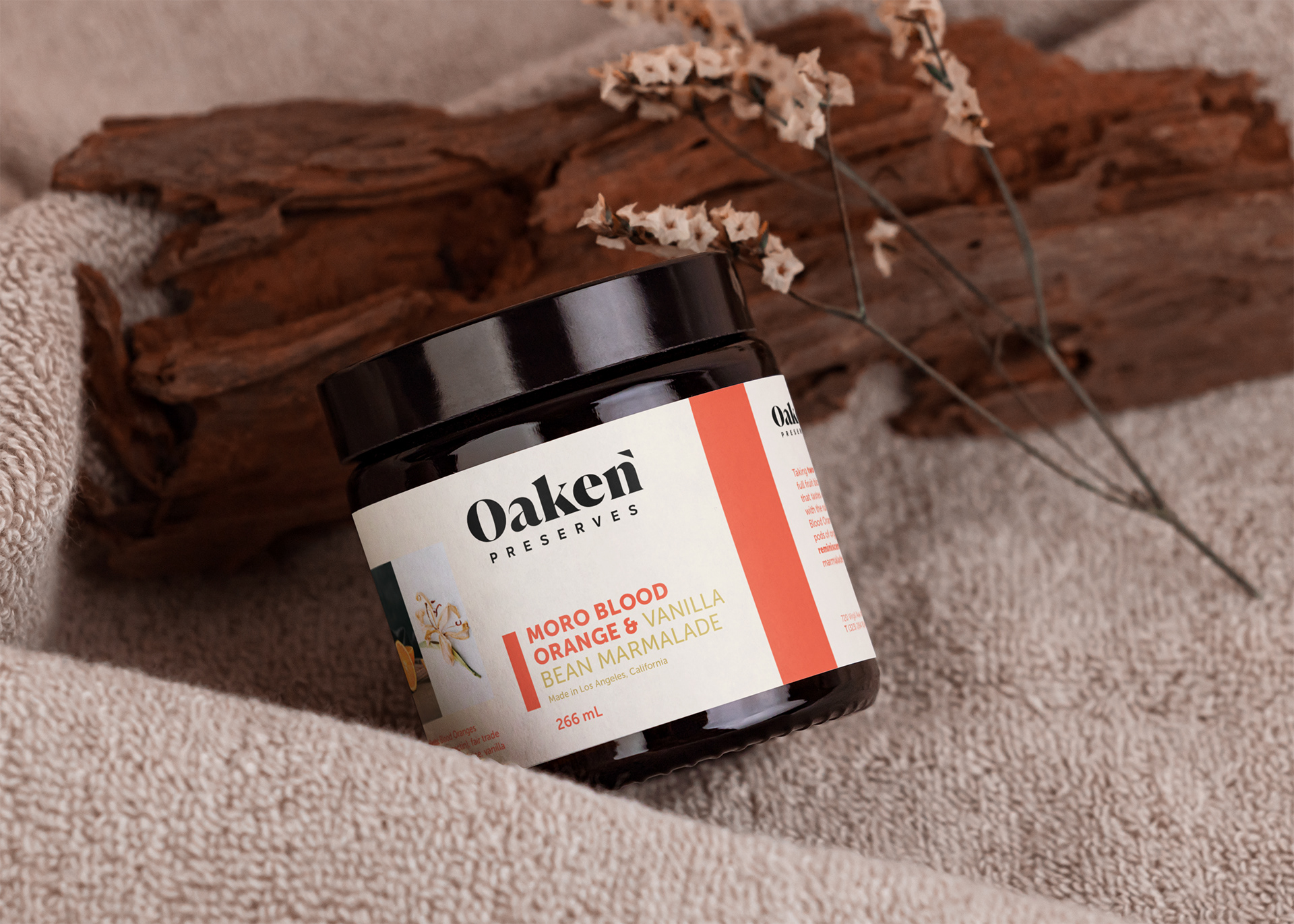
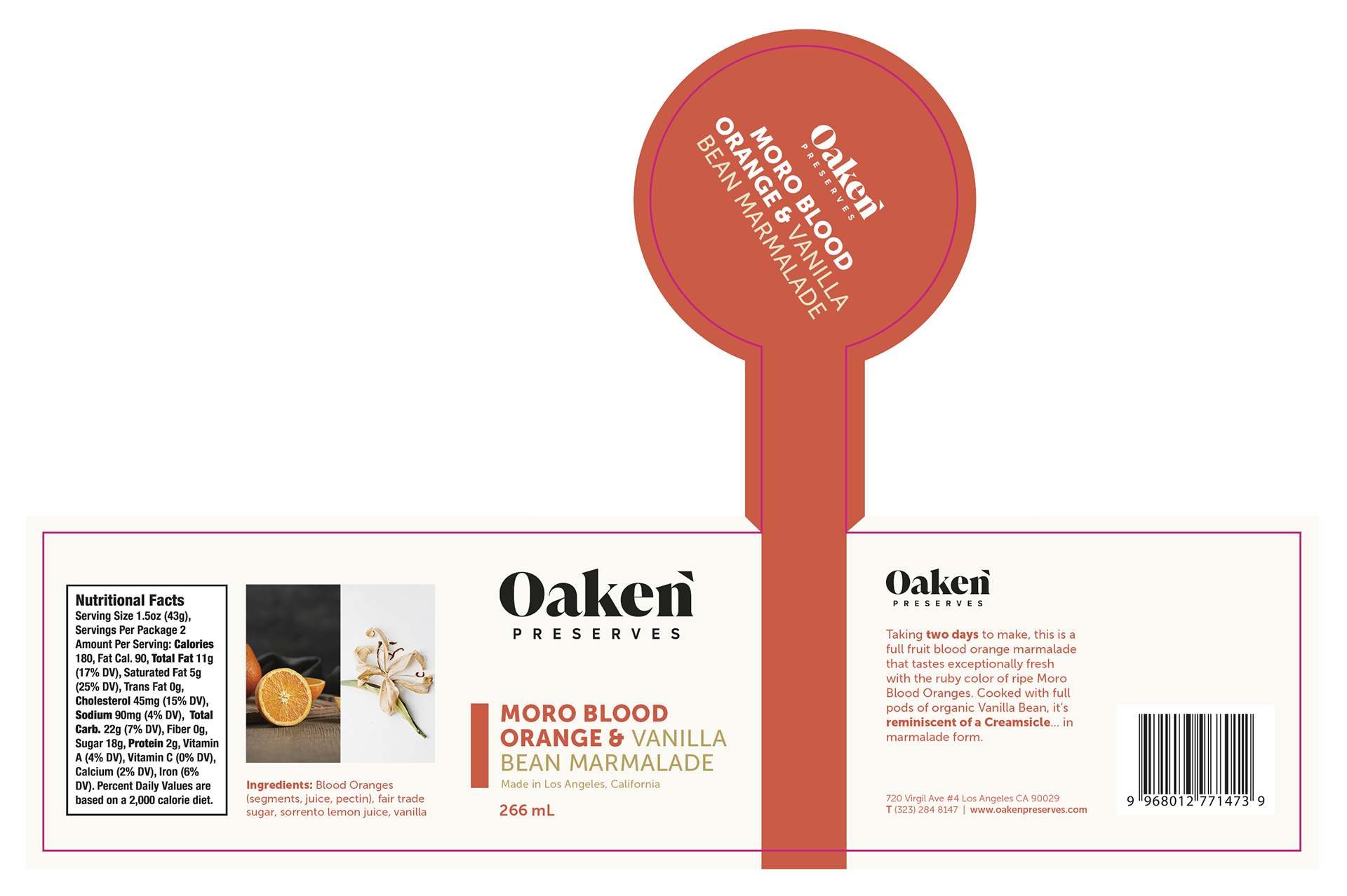
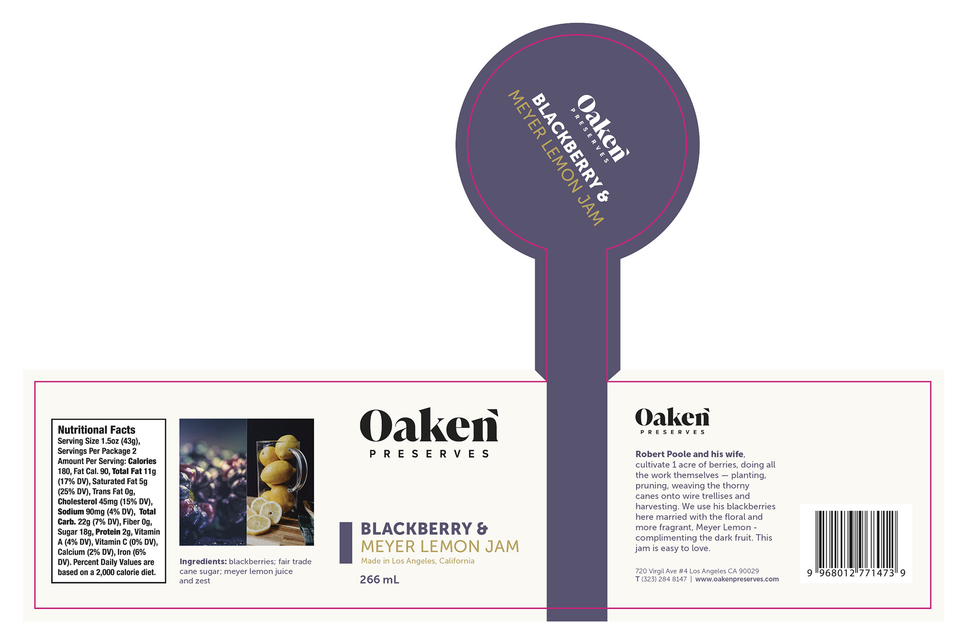
Marmalade Jar Label
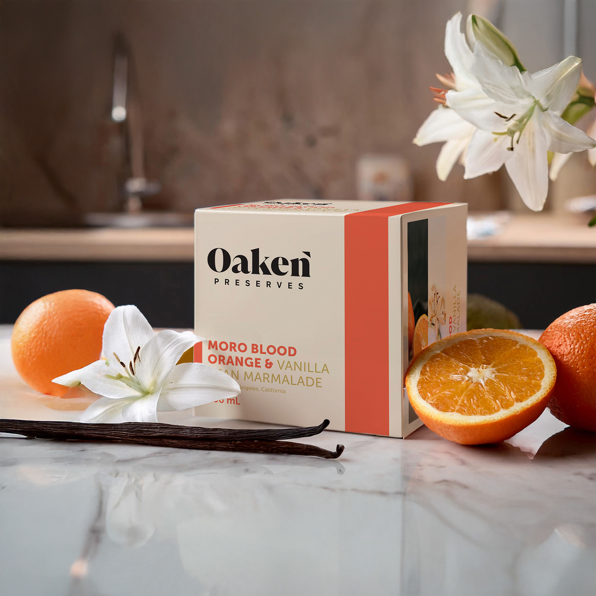
Marmalade Box
Client Background
On the edge of Los Angeles' Silver Lake neighbourhood, is Oaken Preserves. Oaken began as a preserves company in 2011, later expanding into food services. Oaken's food is market-driven; its menu features re-imagined classics, innovative specials, and unheard of dishes. They also offer a rotating selection of desserts. Depending on the season, the company offers preserves to take home in a jar, or on a slab of Brioche toast. Their preserves are made on-site, in copper jam pans, and according to techniques developed in the 1500s.
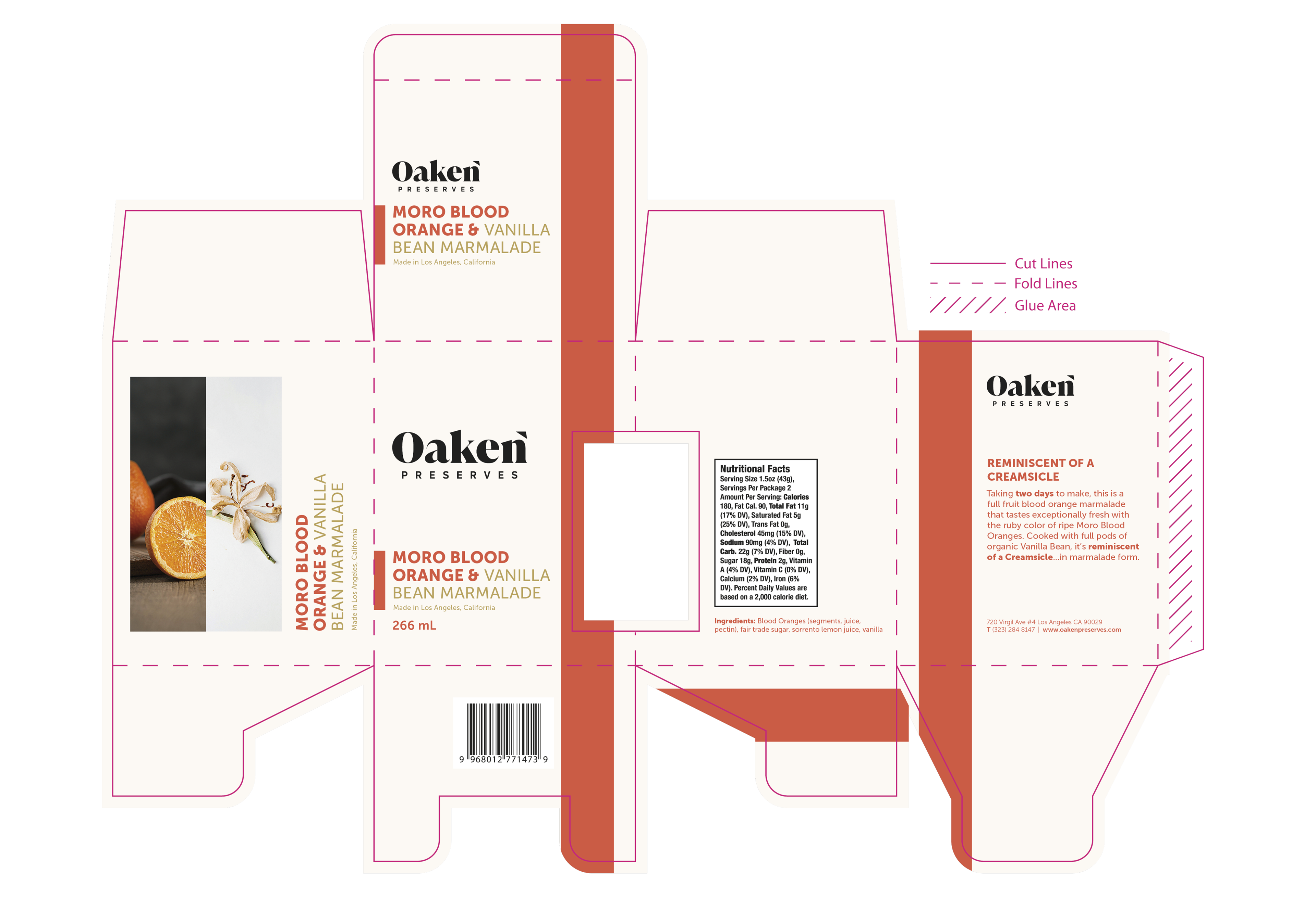
Moro Blood Orange & Vanilla Bean Marmalade Box Dieline
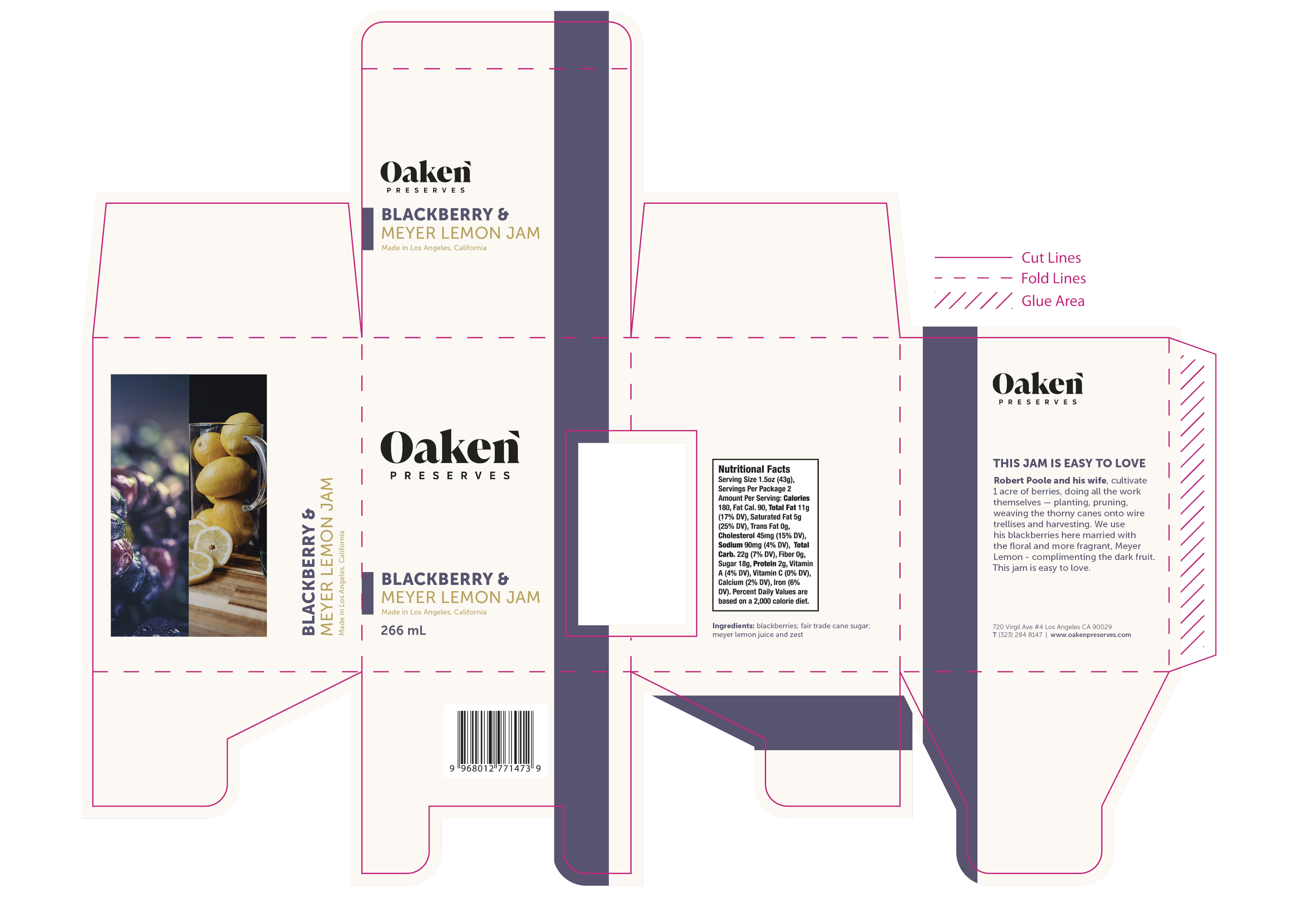
Blackberry & Meyer Lemon Jam Box Dieline
Obstacle & Approach
Oaken needed packaging for its new line of jam flavours, including both a custom box and label for the supplied jar. Known for bold, unconventional ingredient pairings, Oaken wanted packaging that could reflect the unique quality of the product while raising its visual presence on the shelf. The designs needed to highlight flavour through colour and imagery, feel high-end, and remain cohesive across the entire range. Each label and box had to complement one another within a flavour, while also working as a larger system across the product line.
I started by building the box wireframe and dieline. The structure itself needed to be clean and straightforward, allowing the design and product to take center stage. I was provided with the brand logo, barcode, nutritional details, and copy to include. Early concepts leaned more traditional, but after reviewing the brand’s positioning, I shifted toward a minimal, modern look that better aligned with Oaken’s evolving identity. This pivot helped establish a light, open layout, where vibrant bands of colour could pop against the neutral background and signal each flavour clearly.
The coloured bands became a key design element. They wrap around the box and integrate directly with the label, visible through a window in the packaging. After a few layout trials, I refined the band’s placement to ensure it aligned perfectly across both surfaces. I selected imagery that paired the main ingredients side by side, emphasizing the harmony of each blend while keeping the aesthetic clean. I also added a “Made in California” feature to reinforce the brand’s origin and elevate the artisanal tone.
The label design mirrors the box layout for a unified look. The coloured band not only links the label to the packaging but also doubles as a tamper-evident seal, serving as a subtle way to reinforce the brand’s commitment to quality. Applying the labels manually proved to be its own challenge. Aligning the top label to the jar lid while wrapping the base evenly took precision and patience, which gave me a deeper appreciation for packaging that’s both beautiful and practical.
More Blood Orange & Vanilla Bean Marmalade Label Dieline
Blackberry & Meyer Lemon Jam Label Dieline
Summary
Designing for Oaken Preserves was a deeply rewarding experience that reminded me why I love packaging design. Translating bold flavour pairings into a clean, modern visual system pushed me to balance creativity with precision, from dieline construction to the final product. Seeing everything come together made the process feel especially meaningful. It challenged me to think like both a designer and a consumer, leaving me excited to take on more projects that blend history with real-world application.
Programs Used: Adobe InDesign, Adobe Photoshop, Adobe Illustrator